Fireworks Come Early: A Retrospective of the July 1-3 2026 Heat Event in PJM
In this post, we discuss the extreme weather, grid, and market dynamics that characterized the record July 4th week heatwave in PJM.
Temperature Extremes: Decent 5-day Forecasts, Near-Record Levels, Broad RTO Coverage
Similar to Winter Storm Fern earlier this year, most of the weather forecasts picked up on the extreme nature of this event about a week out. Figure 1 presents a screenshot from the Sunairio UI depicting PJM population-weighted temperature realizations and 15-day temperature forecasts from the IFS, IFS Ensemble mean, AIFS, the AIFS Ensemble mean, and Sunairio’s hourly P50 from Friday, June 26 12Z (the Friday prior to the event).
As the tooltip box within the plot shows, forecast expectations were generally very accurate (within a degree or so of realizations) for the July 1 to July 3 period, with the IFS being a bit of an outlier – more than 3 degrees too warm for the peak of the event on Wednesday July 2.
Note as well just how close this temperature index came to setting an all-time record for PJM, which is particularly impressive given how broad the PJM footprint is. As Figure 2 shows, the heat event on July 2 almost perfectly overlapped all population centers within PJM’s territory, driving demand to near-record levels as well.
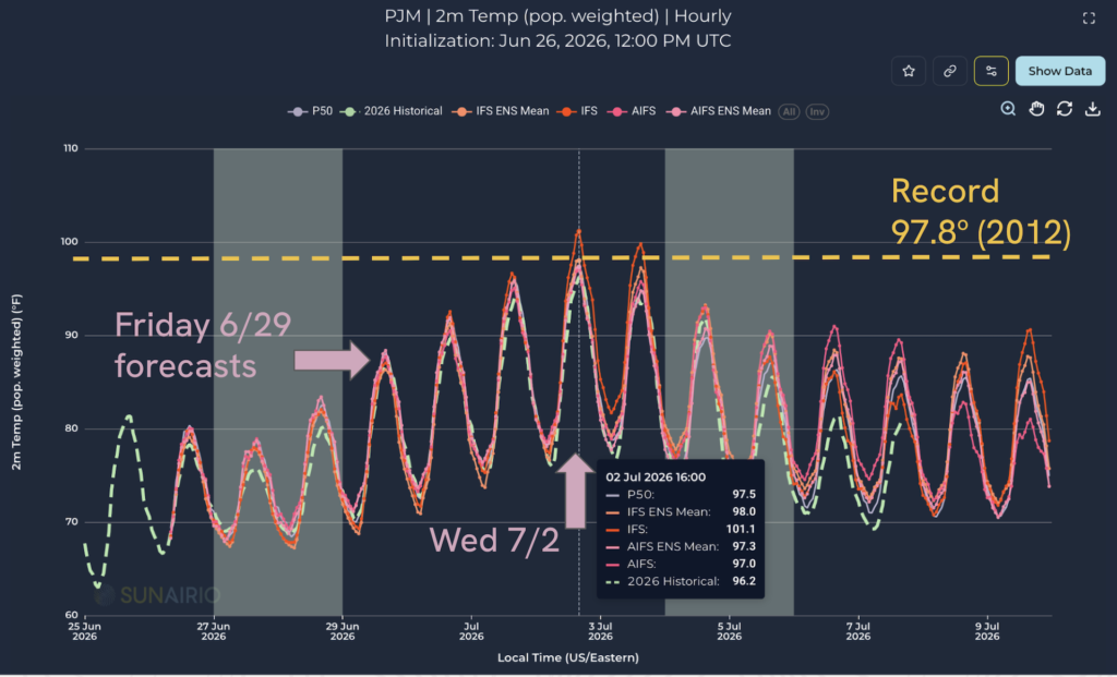
Figure 1. 15-day hourly forecasts of PJM population-weighted temperature from the IFS, IFS ENS, AIFS, AIFS ENS, and Sunairio P50. Also shown are historical actual realizations and the all-time record for this weighted temperature index.
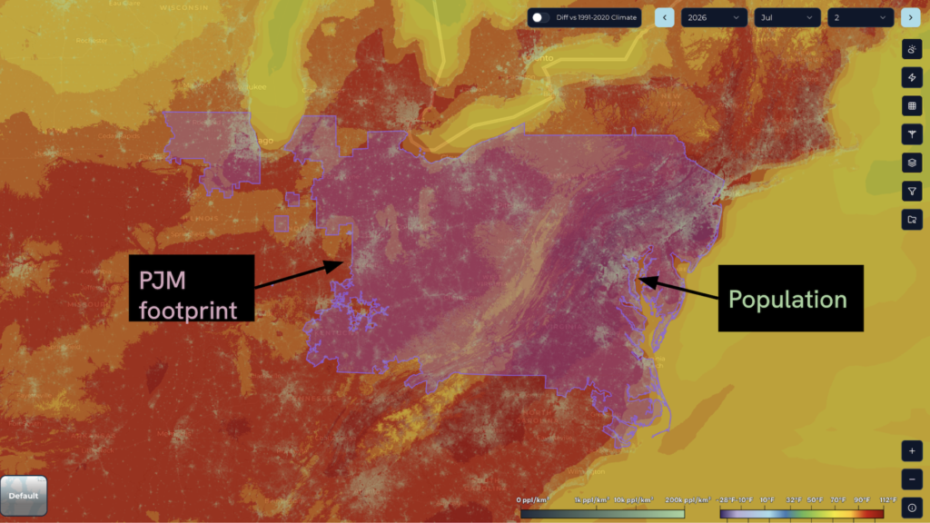
Figure 2. Sunairio High-resolution Earth Data (SHED) 2m daily max historical temperature contours for July 2, 2026. Also overlaid are the PJM RTO footprint boundary and high-resolution gridded population data.
Record Demand Levels and Critical Demand Response
The extreme heat drove zonal and RTO-wide generation to the highest levels we’ve seen in years, and approached all-time records on July 1 and July 2.
Figure 3 plots daily max population-weighted temperature versus daily max load since 2023. As the plot shows, cooling load in PJM (demand sensitivity to temperatures above 65 deg F) increases in an approximately linear fashion. Additionally, this heat wave produced three of the most extreme (“upper-right”) points.
In order to manage the associated extreme level of grid stress and ensure that generation reserves stayed above contingency requirements (basically ensuring that reserves are greater than the single largest potential unit trip), PJM activated various levels of Demand Response (DR) (120-min lead time, 60-min lead time, and 30-min lead time) throughout the day on July 2 and again on July 3. Note that PJM did NOT activate Demand Response on July 1 (more on this later).
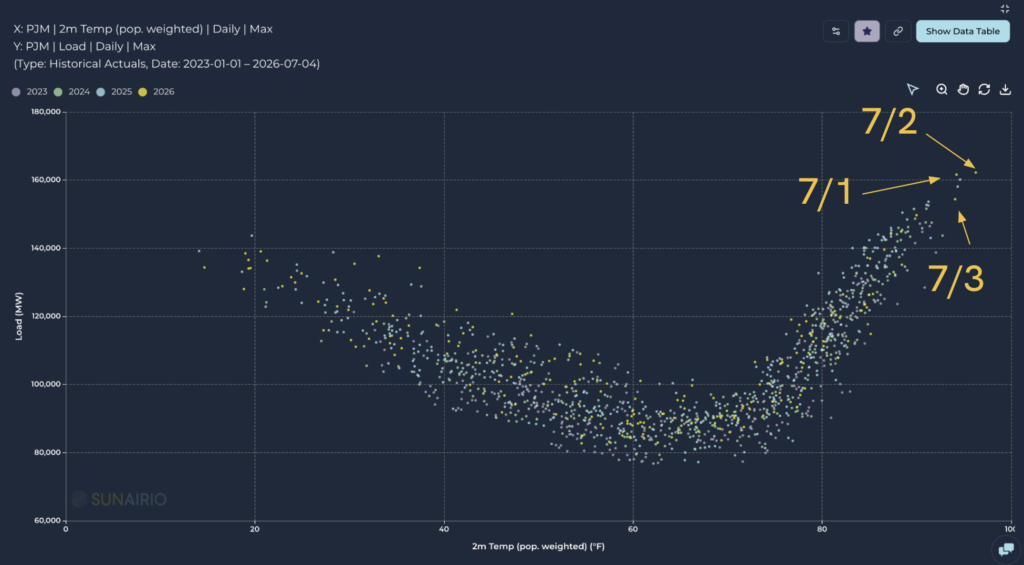
Figure 3. Daily max PJM population-weighted temperature vs daily max PJM load, 2023-July 4, 2026
Zooming in on the cooling regime above 70 degrees and only plotting 2026 (Figure 4), we can clearly see that the linear relationship between temperature and load broke down on July 1 and 2 – but there was more than one demand-reducing dynamic to blame.
On July 2, the difference between the normal linear relationship and actual load is the effect of demand response and coincident peak shaving (commercial and industrial customers reducing their demand to lower their measured consumption in the anticipated ISO peak load interval, thereby lowering demand charges). On July 3, two factors contributed to lower demand: A) demand response/peak shaving and B) a holiday effect caused by the observance of July 4 (which fell on Saturday this year).
Regarding the magnitude of demand reduction actions on July 2 and July 3 – this chart alone implies that we observed approximately 5 GW of load reductions, and potentially up to about 7 GW on July 2.
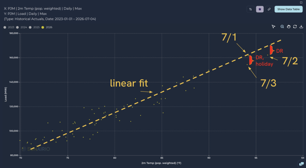
Figure 4. Daily max temperature vs daily max load, 2026, and a linearly-fitted trend line. July 1-3 are shown along with the approximate reductions due to demand response, peak shaving, and holiday effects.
NERC Emergencies, RT Price Maximums, and a Threat to Data Centers
As the day wore on during the July 2 afternoon, reserves continued to fall in PJM even though all DR programs had been activated and real-time (RT) prices approached the $2,000/MWh offer cap. With no more market-based solutions available, PJM issued a NERC EEA 2 emergency at 5:00 PM for the entire system, indicating that reserve levels were likely to fall below required minimum levels without extraordinary interventions.
Over the next hour, PJM issued two of these extraordinary directives. At 5:32, the ISO warned of the “potential need to direct Large Loads to operate on Back-up Generation,” effectively warning any data center with backup generation that it was about to be disconnected from the grid. Although PJM did not follow up with the actual disconnect order, this is the closest the ISO has come to initiating this new emergency measure – first requested (and granted by DOE) before Winter Storm Fern.
Minutes later at 5:36 PM, PJM issued a “Deploy All Resources Action,” which ordered all generators to operate at Emergency Maximum levels.
At this point, RT prices had climbed well above $2,000 in the Mid-Atlantic sub-region.
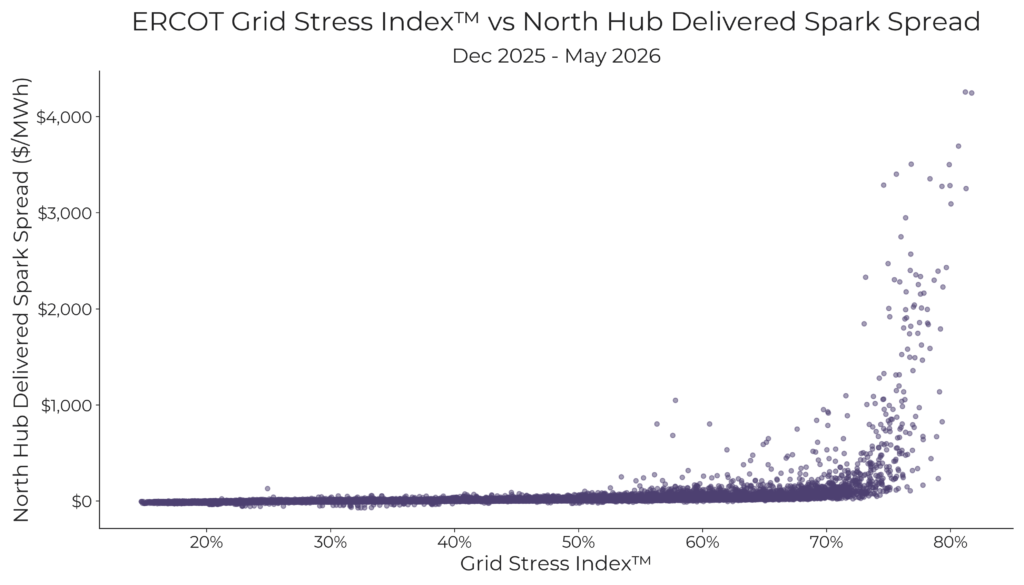
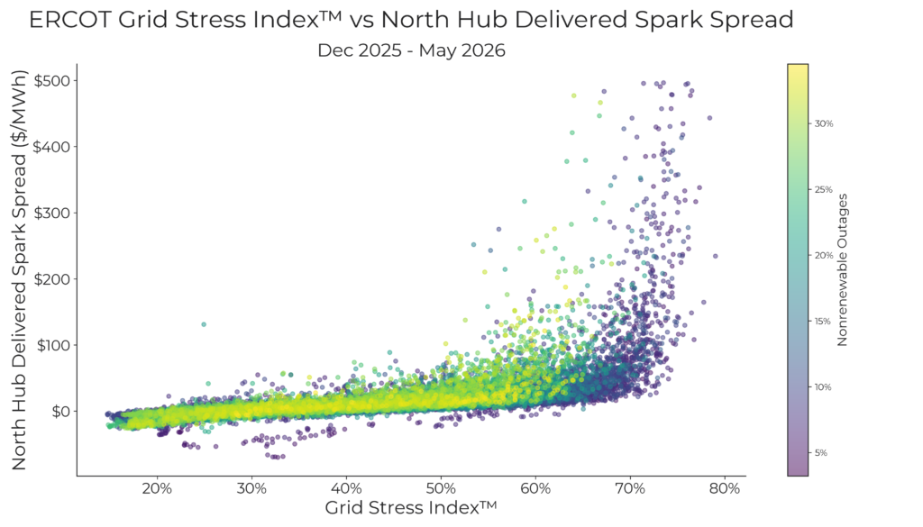
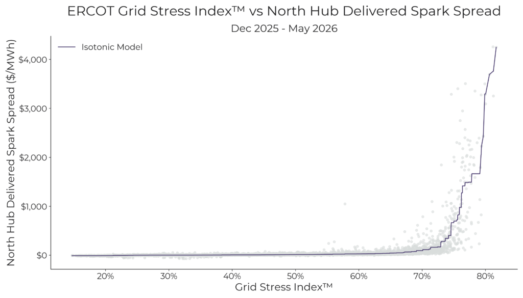
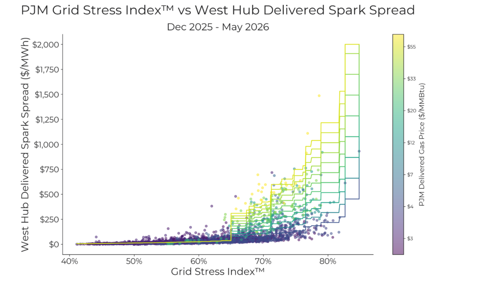
Turning to Figure 5, we can see exactly how severe the conditions were by plotting Sunairio’s Grid Stress IndexTM, our proprietary measure of dispatchable capacity utilization, for 2026 year-to-date. As the plot of daily maximum GSI shows, July 1-3 were the tightest days on the grid in 2026, exceeding levels seen during Fern, the cold snap on February 9, and the EEA 1 alert days on May 18-19.
Curiously though, we recorded a lower overall maximum GSI level on July 3 (86.2%) vs July 1 (89.4%) even though PJM operated as if July 3 was tighter – issuing an EEA 2 emergency and activating DR.
We believe these actions can be partly explained by conservative human behavior in the control room. That is, we hypothesize that grid operators erred on the side of caution on Friday July 3 after seeing just how close the system came to reserve level violations on Thursday July 2. Moreover, the operators may have worried that any call to action (such as demand response) would yield less participation on Friday compared to Thursday given the observed holiday.
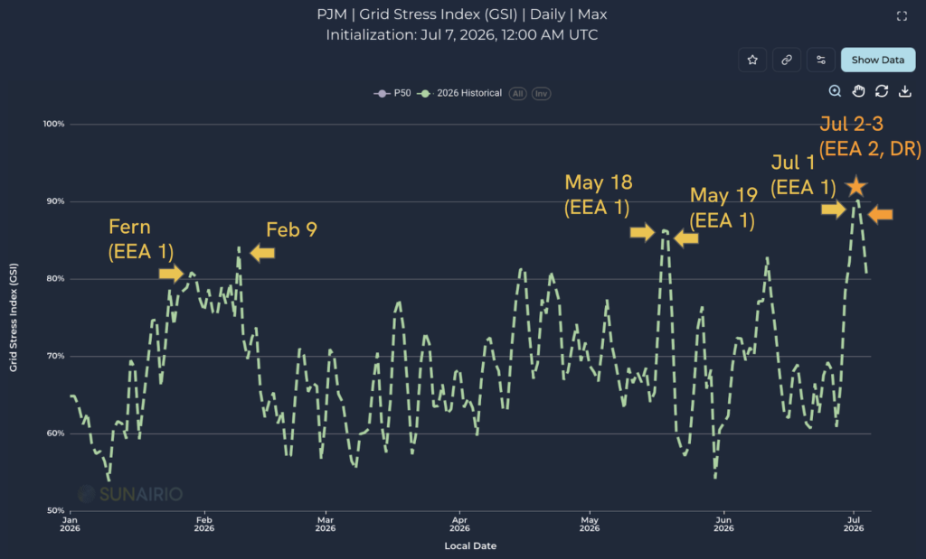
Figure 5. Daily max Grid Stress IndexTM for January 1 - July 4, 2026.
Extreme Price Risk Captured by Sunairio ONE
Putting this all together, we return to the Friday before the event (June 29) to examine how well Sunairio’s PJM price forecast captured this market risk. As Figure 6 shows, Sunairio did an excellent job of highlighting the massive market upside (here plotting the average of DA and RT Western Hub) centered on July 2.
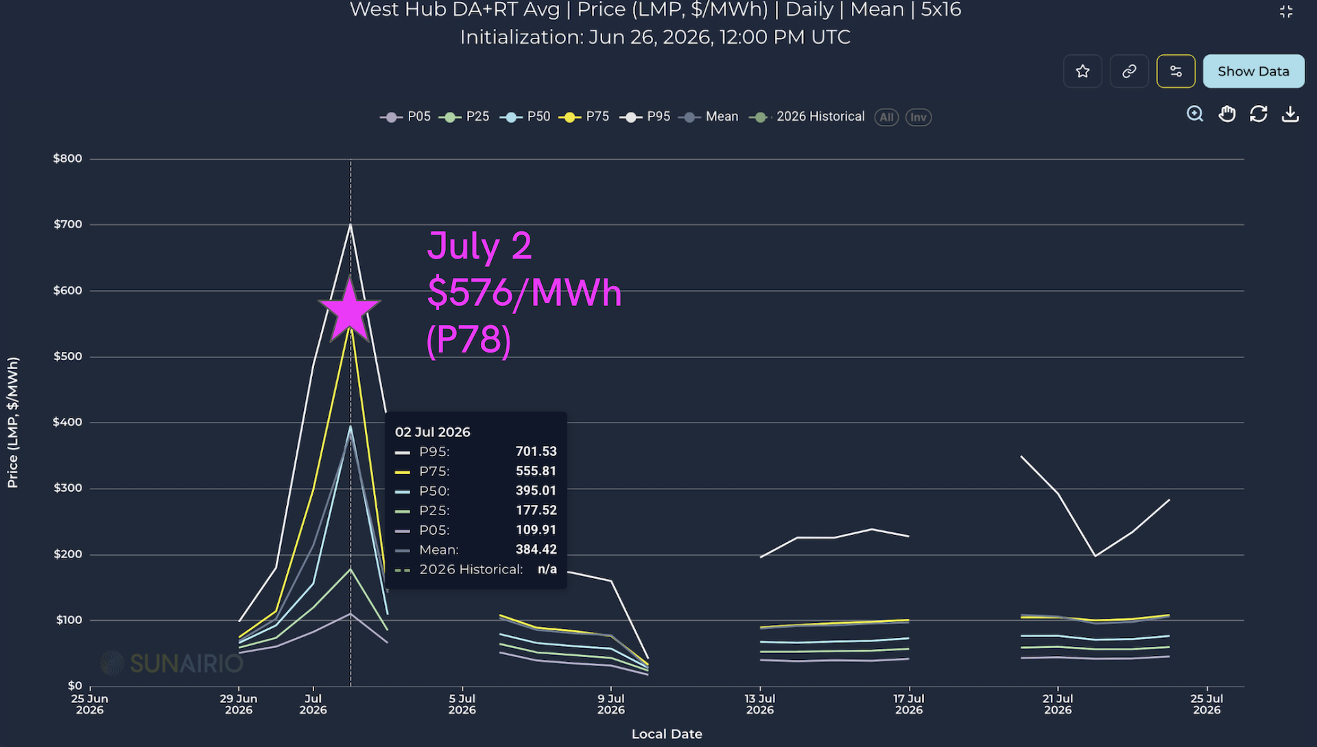
Figure 6. Sunairio forecast of Western Hub Daily 5x16 prices, initialized June 29 12 Z. The July 2 extreme event realized at P78 of our forecast.
Conclusions
- The July 1-3 2026 heat wave was reasonably well forecasted by most weather models 5 days out.
- Realized temperatures soared across the PJM RTO footprint, coming within 1 degree of all-time records.
- PJM activated Demand Response and issued the first widespread grid emergency (NERC EEA 2) since Winter Storm Elliott.
- We observe approximately 5-7 GW of demand reduction on July 2 and July 3, encompassing DR actions and coincident peak shaving.
- Sunairio’s probabilistic price forecast did an excellent job of anticipating the extreme market outcomes – faithfully predicting the upside-skewed distribution for Western Hub prices, which realized at P78 of Sunairio’s forecast from 5 days out.