Sunairio Launches Asset-Level Generation Potential Forecasts to Fill Data Gap for Energy Traders & Grid Planners
By reconciling high-resolution weather ensembles with asset-specific Digital Twins, Sunairio provides the missing data needed to quantify curtailment, congestion, and basis risk across the grid, for thousands of utility-scale wind and solar farms throughout the US.
Baltimore, MD. — March 26, 2026 —Sunairio, pioneer of next-generation grid forecasting software, today announced the launch of its hourly Asset-Level Generation Potential Forecasts. This new capability provides hourly predictions for every utility-scale wind and solar farm across major power market regions, beginning with ERCOT.
Asset-level Generation Potential forecasts provide the high-fidelity visibility required to navigate the ever-evolving grid, helping to quantify the supply-side volatility that drives congestion, curtailment, and basis risk in modern power markets.
Sunairio generation potential forecasts differ from traditional regional wind and solar generation forecasts in two important ways:
They provide individual energy forecasts for every utility-scale project — not just regional aggregations — allowing users to anticipate local variability down to the nodal level.
They forecast potential generation compared to traditional renewable forecasts that are designed to forecast actual generation after curtailment.
By forecasting weather-driven potential generation, rather than post-curtailment energy, Sunairio Asset-Level Generation Potential Forecasts can be used as high-quality inputs for power flow and trading models. Traditional as-generated renewables data, on the other hand, can’t be easily used to model the grid because they represent a curtailed solution of the grid operator’s dispatch model, not an input to it.
"Trying to anticipate transmission congestion with traditional renewables forecasts is essentially guesswork to find the missing MWs," said Rob Cirincione, CEO, Sunairio. "Our Asset-Level Generation Potential Forecasts isolate the weather-driven energy potential from grid-enforced physical limits, allowing users to quantify the volume of energy at risk of curtailment before it happens."
The forecasts are powered by two proprietary Sunairio technologies:
Sunairio Digital Twins: High-fidelity, physics-based models of over 1,400 wind farms and 7,500 solar farms.
Sunairio ONE: A high-resolution weather forecast ensemble that provides the hyperlocal inputs necessary to drive the Digital Twins.
The launch of Asset-Level Generation Potential Forecasts provides critical, nodal-specific insights for a variety of stakeholders navigating today's increasingly complex power markets:
For nodal traders: By aligning generation potential with historical nodal price data, traders can predict the likelihood of nodal congestion.
For hub traders: Zonal generation potential aggregations reveal macro signals that drive zonal basis spreads. This signal is completely obscured in actual (post-curtailed) generation data.
For grid planners: The data serves as a high-precision input for production cost modeling, helping grid planners identify the exact transmission infrastructure needed to realize specific volumes of weather-driven energy potential.
Sunairio ONE represents a shift from reactive grid observation to predictive, physics-based intelligence. For more information, please visit sunairio.com or email info@sunairio.com.
###
About Sunairio Founded in 2020, Sunairio is the pioneer of award-winning, next-generation grid forecasting software that’s the first to provide integrated energy, weather, and climate insights. Sunairio helps energy traders, grid operators, utility-scale asset developers, and VPP and demand response aggregators make better commercial decisions in the face of increasing grid variability and extreme event risks. Sunairio and Sunairio ONE have received recognition from the NSF, ACP, and EPRI. For more information, please visit sunairio.com.
Media Contact Logan Varsano, Inflection Point Agency for Sunairio logan@inflectionpointagency.com
The Pure Meteorological Signal: Launching Sunairio Asset-Level Generation Potential Forecasts
Generation Potential: The Pure Meteorological Signal
Forecasting the weather-driven energy production of wind and solar farms is critical for understanding the physical impact renewable generators have on the grid: variable power flow dynamics, regional supply-demand balances, and ultimately economic price risk. Yet the renewable generation data that’s typically been available to forecasters and grid modelers has a fundamental flaw: it’s reported after curtailment. That is, when historical renewable generation data is provided from public sources, those data sets report as-generated values that include losses due to curtailment (caused by transmission congestion that limits renewable output).
This means that forecasts designed to predict actual renewable generation are missing the most important piece of the story: the potential generation that could have been produced if not for the congestion – i.e., the true meteorological signal of renewable generation risk.
Today Sunairio is excited to fill this gap by launching hourly Asset-Level Generation Potential Forecasts for every utility-scale wind and solar farm across major ISO power markets, beginning with ERCOT. By combining high-resolution Sunairio ONE weather forecast ensembles with high-fidelity wind and solar farm Sunairio Digital Twins, Asset-level Generation Potential Forecasts provide the purest signal of variable generation-driven price volatility on the grid – from individual generator nodes all the way up to ISO-level aggregates and trading hubs.
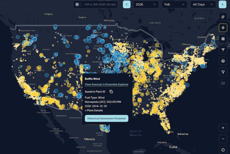
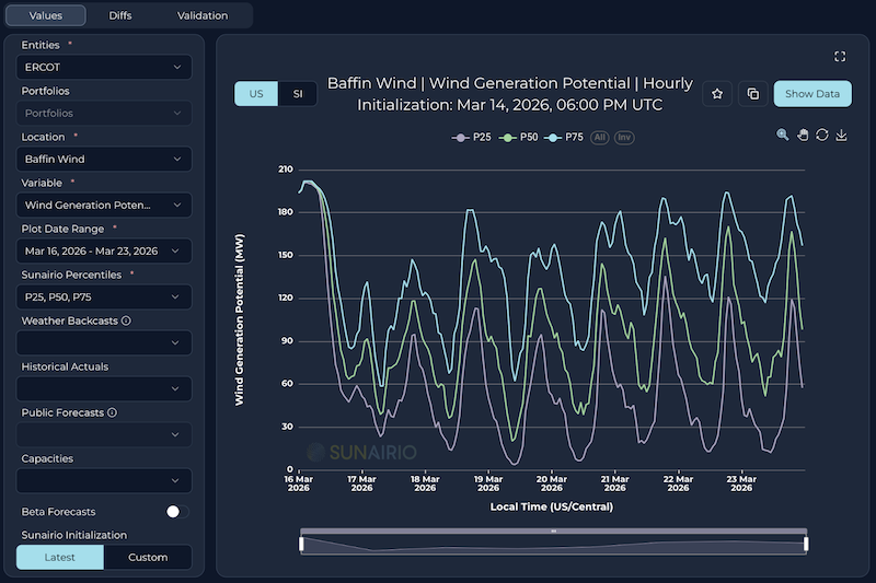
Figure 1 provides a sneak peak of what this feature looks like in our platform.
Figure 1. (Left) Map of solar and wind assets in the Sunairio Maps module; (Right) Example wind asset forecast shown in Sunairio Ensemble Explorer module.
Why it Matters: The Unseen MWs that Actually Drive Congestion
The as-generated energy vs. generation potential nuance creates a vexxing problem for anyone trying to understand power market fundamentals. First, it means that we can’t try to replicate past market outcomes by simply using as-generated wind and solar values as inputs to engineering models of the grid – because that actual generation was potentially a curtailedsolution of the balancing authority’s dispatch model, not an input to it. Moreover, it means we can’t easily distinguish between A) an hour that had low renewable generation because the wind/solar resource was low and B) an hour that had low renewable generation because the wind/solar resource was so high that it was curtailed due to congestion.
Trying to triangulate the curtailment signal from LMP or raw weather is messy and difficult given the often non-linear relationship between weather and renewable generation. The fundamental signal we want is straightforward: weather-driven hourly renewable generation before curtailment.
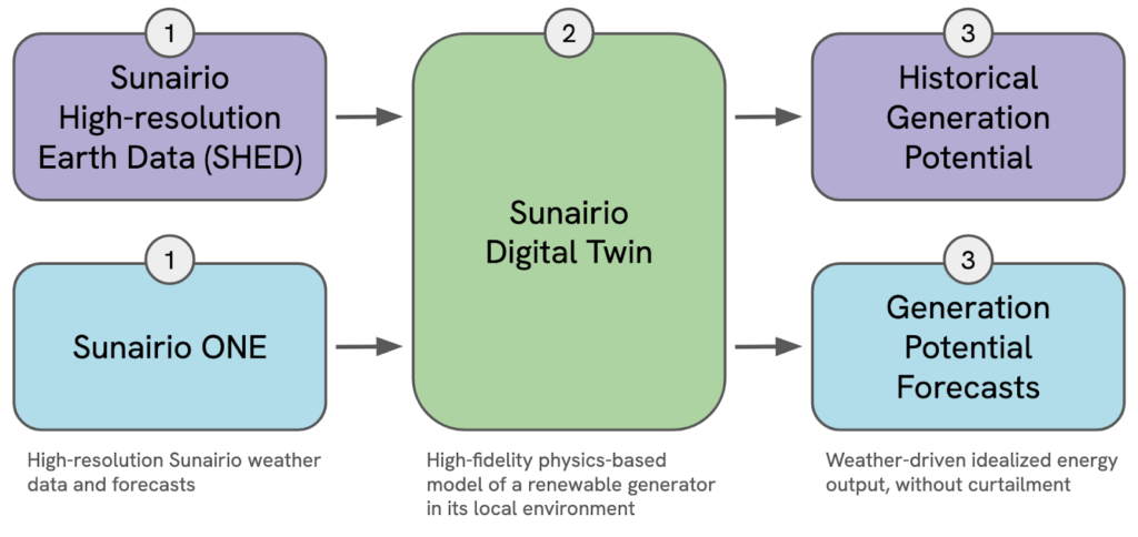
How We Do It: Sunairio ONE + Sunairio Digital Twins
Creating Generation Potential starts with building a Sunairio Digital Twin – a high-fidelity physics-based model – of each asset. Sunairio Digital Twins incorporate plant-level technical characteristics (turbine coordinates, hub heights, power curves, PV tracking, PV panel efficiency, etc.) in addition to hyperlocal terrain modeling. For wind, this includes running a 100m-resolution CFD model over the farm footprint to translate mesoscale (3km) wind speed averages into 100m-resolution turbine-scale wind speed fields, and then factoring in turbine-by-turbine waking. For solar, we leverage the best-in-class PVLIB solar modeling suite to replicate asset-specific generation characteristics. These Sunairio Digital Twins already support our existing Historical Generation Potential dataset – covering more than 1,400 utility-scale wind farms and 7,500 utility-scale solar farms – and leverage our market-leading Sunairio High-Resolution Earth Data (SHED) as the source for historical weather.
With the development of Sunairio ONE, we’re now able to provide Generation Potential forecasts, in addition to historical Generation Potential, for all of these renewable sites (Figure 2). By isolating the weather-driven potential from the grid-enforced transmission limits, we enable our users to quantify the volume of energy at risk of curtailment before it happens – and identify high-conviction nodal arbitrage opportunities that post-curtailment forecasts overlook.
Figure 2. Process of creating Generation Potential given weather inputs and Sunairio Digital Twin model of a wind or solar asset.
Performance: Accuracy Where It Matters
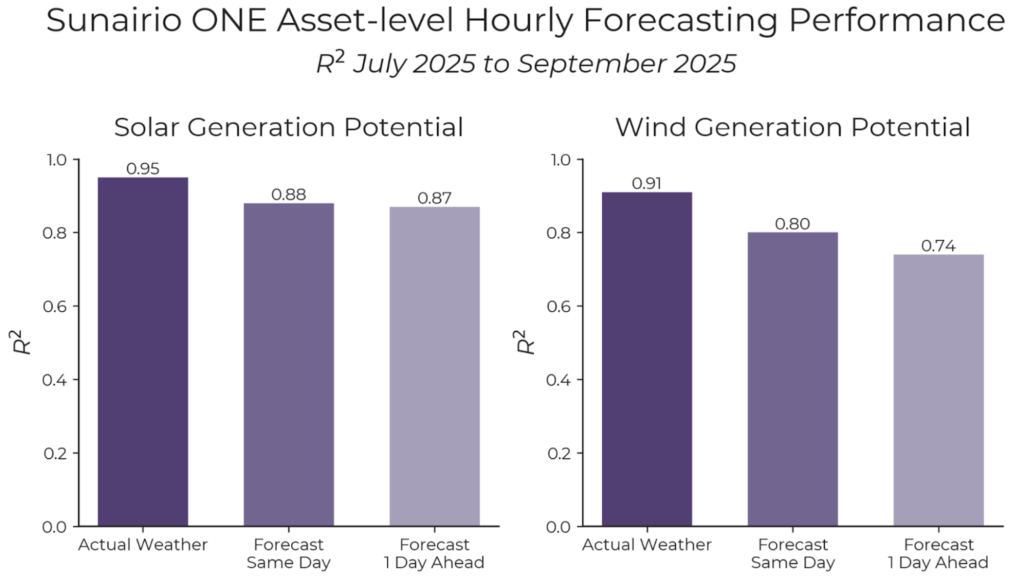
We validated our Asset-Level Generation Potential Forecasts against data from IPP partners to confirm how they perform in real-world conditions. For this analysis, we limited our scope to sites that could provide a complete generation picture: hourly availability, hourly curtailment, and hourly net generation. By accounting for availability and adding back curtailment MW we’re able to validate our generation potential forecasts on an apples-to-apples basis.
On a portfolio of three solar sites and six wind sites, Sunairio’s forecast of Generation Potential using same-day and day-ahead weather forecasts achieved scores similar to that of using historical actual weather (Figure 3).
Figure 3. Forecast validation results for a solar portfolio and wind portfolio over three months.
For Nodal Traders: The "Electric Peninsula" Case Study
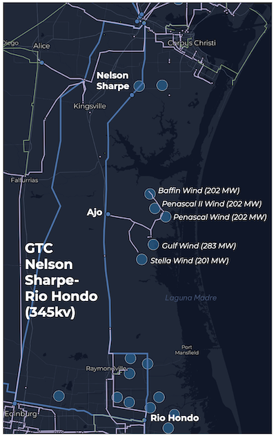
An analysis of the coastal wind farm cluster near the Ajo substation in ERCOT South demonstrates the impact of renewable generation on transmission congestion and highlights the value of Sunairio Generation Potential forecasts for nodal trading.
As shown in Figure 5, five wind farms totaling more than 1,000 MW compete for transmission capacity on the lone path off the coast: the Nelson Sharpe - Rio Hondo line. The Nelson Sharpe - Rio HondoGeneric Transmission Constraint (or NELRIO GTC) in Kennedy County, TX is a notorious bottleneck that ranked as the third most frequently binding constraint in 2025 (Potomac Economics) (Figure 5).
Figure 5. Map of five wind farms and the transmission lines associated with the Nelson Sharp- Rio Hondo Generic Transmission Constraint in ERCOT.
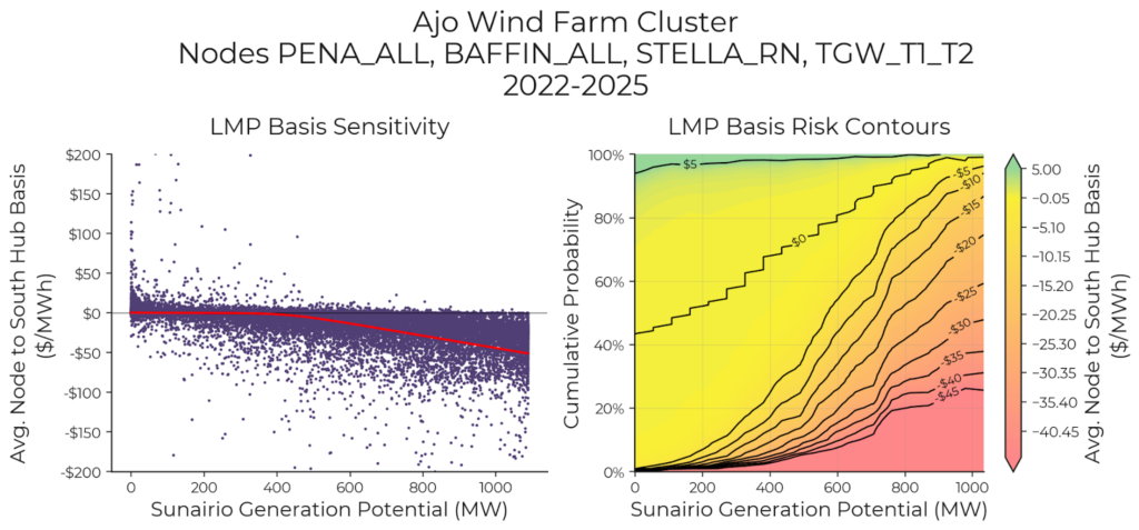
Using Sunairio’s Historical Generation Potential and aligning with three years of historical node and hub LMP data, we can explore the relationship between Generation Potential for this cluster of wind farms and the average node to South hub basis (Figure 6, left). (Note that from 2022 to 2025, the four nodes associated with this cluster of wind farms experience the same real-time LMP in 99.99% of hours.) As the left panel shows, as Generation Potential for that wind farm cluster increases, there is a non-linear shift in the occurrence of more negative local basis.
Traders can visualize this conditional probability of congestion as a surface with Generation Potential (Figure 6, right). Given a Generation Potential of ~900 MW, there is a 90% chance of the LMP basis being less than or equal to -$5, and a 85% chance of it being less than or equal to -$10. For virtuals traders trading into the day ahead market to take on congestion exposure, Sunairio asset-level Generation Potential forecasts are a powerful tool for building optimal bid/offer ladders and accurately quantifying the risk of the resulting trading strategy.
Figure 6. (Left) Sunairio Generation Potential vs. average node basis to South Hub of the five wind farms (2022 to 2025).(Right) Conditional probability of real-time congestion of the nodes associated with the five wind farms.
For Hub Traders: Generation Potential Zonal Aggregations Reveal Macro Signals
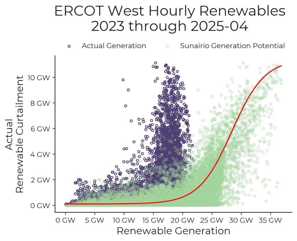
Asset-level generation potential forecasts aren’t just useful for nodal trading. When aggregated up to load zone or ISO-aggregates, they provide a powerful signal of the regional and market-wide curtailment that’s necessary to balance the grid. For example, Figure 7 shows a strong correlation between total ERCOT West Zone Generation Potential and actual West Zone curtailment, which isn’t visible when looking at Actual (post-curtailed) Generation. Predicting this dynamic via generation potential forecasts is critical for managing zonal basis risk.
Figure 7. Total ERCOT West Sunairio Generation Potential provides a strong signal of actual total renewable curtailment in the region while actual (post-curtailed) generation completely obscured the relationship
For Grid Planners: Precision for Planning and Production Cost Modeling
Beyond trading, this granularity is the new baseline for production cost modeling (PCM) and Grid Planning. Our hourly Asset-Level Generation Potential is ideally suited as an input for every individual renewable generation node of SCED models.
Further, Sunairio’s Generation Potential data enable planners to precisely quantify the incremental export capacity required to mitigate regional congestion and validate the specific transmission infrastructure necessary to support it. This shift moves the analytical focus from generalized capacity expansions toward targeted infrastructure investments designed to realize a specific volume of weather-driven energy potential.
See the Signal, Find the Missing MWs
The increasing penetration of intermittent renewables and the rising occurrence of unprecedented weather have rendered historical grid performance a diminishingly reliable proxy for future risk. The integration of Sunairio ONE-powered Generation Potential forecasts at the asset level provides the high-fidelity visibility required to navigate a fundamentally decentralized grid.
By reconciling high-resolution weather modeling – including terrain-induced fluid dynamics and advanced irradiance physics – with Digital Twin asset specifications, Sunairio replaces regional approximations with nodal-specific signals. This granularity is essential for quantifying the supply-side volatility that drives congestion, curtailment, and basis risk in modern power markets.Sunairio ONE represents a shift from reactive grid observation to predictive, physics-based intelligence. Want to see the Generation Potential for your most congested nodes? Contact us to run your portfolio through Sunairio ONE.
ERCOT’s 85 GW load forecast for Winter Storm Fern wasn't just high—it was indefensible
We’re one month removed from the havoc that was Winter Storm Fern. Focusing on its effects in ERCOT, we dug into the weather, grid, and market fundamentals to provide six strategic insights:
1. Five days out, temperature forecasts disagreed about timing and intensity but were reasonably correct about the event low/peak heating period on 1/26. While the peak heating event was relatively extreme, in this particular case it wasn’t much of a short-term surprise. In terms of long-run climatology though, the peak heating event on 1/26 was a P99 event for that calendar day, the week was a P97 and the month was P65.
2. ERCOT appears to have deliberately biased their load forecasts high (incorrectly). Assuming ERCOT was using weather forecast consensus (which was relatively accurate) as the input, we find their 85 GW forecast for 1/26 and 80 GW forecast for 1/27 to be essentially indefensible, falling well outside the range of recent weather-load relationships.
3. ERCOT appears to have deliberately biased wind generation forecasts low (correctly). We know this because their STWPP forecast (representing a P50 level) was below their WGRPP forecast (representing a P20 level). They appear to have manually adjusted the STWPP low but left the WGRPP alone, creating a mathematically impossible scenario.
4. Load in West Texas was significantly affected by icing of oil and gas infrastructure. A large share of load growth in West Texas has been driven by the electrification of oil and gas drilling and processing. When these wells/pipes froze, the associated electrical compression didn’t operate, resulting in exceptionally low load.
5. The market result: a high day-ahead (DA) clear driven by ERCOT’s posturing and then a real-time (RT) fail due to reality and load destruction. ERCOT’s posturing appeared to have the intended effect, supporting a high DA clear with ample reserves to blunt the risk of RT market capacity shortfalls — even in the face of lower than expected wind.
6. Sunairio’s price forecast explained the actual realization and the advanced market fear premium. Looking at our forecast of the 1/26 5x16 North Hub locational marginal pricing (LMP) realizations from the week before, we can see that our expected value was almost spot on, while the long tail to the right explains why some were willing to pay $600+ (because there was a small chance of clearing over $1,000). Note: the mean of our price distribution was at the 80th percentile — far from the median — because of the extreme right skew (risk of high prices).
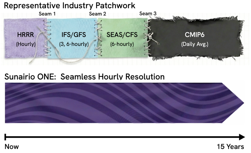
Sunairio ONE In-depth Part 3: Beyond the Patchwork: Achieving Seamless 15-Year Hourly Ensemble Forecasting
Over the past few weeks, we have explored what makes Sunairio ONE a "next-generation" forecast. In Part 1, we discussed the necessity of a calibrated ensemble that accurately captures extremes. In Part 2, we demonstrated why high spatial and temporal resolution is critical for modeling modern renewable assets like wind and solar. In this final installment, we show that Sunairio ONE provides a unified, seamless outlook from hours to years, eliminating the fragmentation issues that the industry faces today.
The Current Landscape: A Patchwork of Compromises
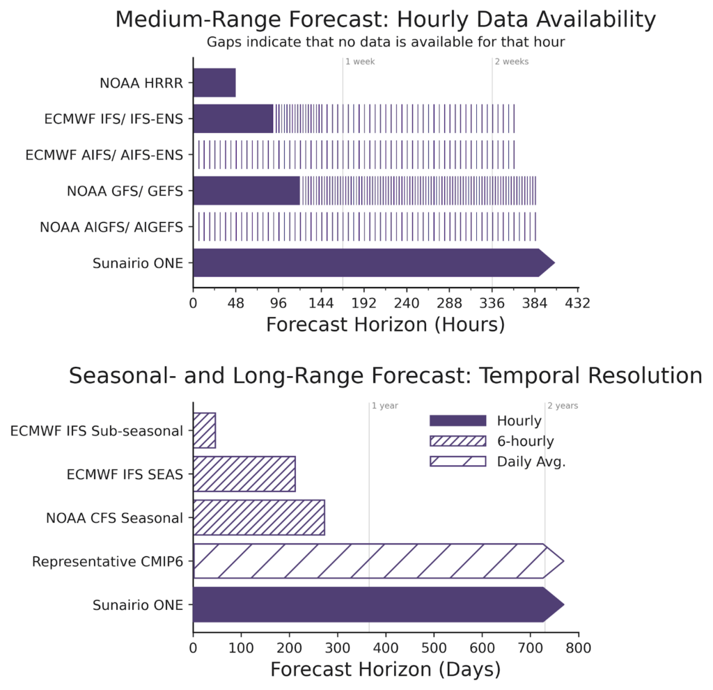
Today, energy traders, grid operators, and other energy professionals have access to a growing collection of public weather forecasts that are each published with differing outlook horizons, temporal resolutions, and refresh schedules.For example, NOAA’s HRRR provides hourly forecasts for the next two days. Other forecasts, such as the GFS or ECMWF’s IFS, stretch to about 2 weeks, but with lower temporal resolution further in the outlook period (see Figure 1, top panel). Seasonal-range forecasts such as the CFS or IFS SEAS look many months into the future, but are low temporal resolution (see Figure 1, bottom panel) and in the case of the SEAS, published only once per month, letting forecasts go stale quickly. While most weather forecasts are updated just four times per day (e.g., 00Z, 06Z, 12Z, and 18Z) or fewer, Sunairio ONE is refreshed each hour using the latest information.
To look beyond 9 months, one must turn to climate models (the current iteration of models are known as CMIP6) instead of weather forecasts, which can be significantly biased, typically provide only vague daily averages, and obscure intraday volatility.
Figure 1. (Top panel) Even within a short 16-day outlook, alternative forecasts provide sparse data with low temporal resolution across days while Sunairio ONE provides dense hourly data without gaps; (Bottom panel) For seasonal or longer outlook periods, only Sunairio ONE provides hourly data.
Thus, in order to build a complete picture of future weather risk– both in the short-term and in long-term planning– energy traders and asset managersneed to stitch together information across multiple sources in a patchwork manner as illustrated in Figure 2. This fragmented approach requires building multiple complex data pipelines, and perhaps more importantly, it makes it challenging to synthesize insights for key operational and planning decisions. Sunairio ONE provides the seamless solution that the industry needs.
Figure 2. The standard industry approach involves stitching together different models with varying resolutions, creating data "seams" and leaving a massive void for long-term planning. Sunairio ONE provides a seamless long-term outlook.
The Sunairio ONE Advantage: The Unbroken Line
Sunairio ONE was designed to eliminate the seams that exist when moving across timescales, providing full continuity and high resolution.
How is it possible to generate a credible hourly ensemble forecast a decade in advance?
It requires bridging the gap between traditional numerical weather prediction (NWP) and long-term climate modeling. Sunairio ONE is not just "extending" a standard weather model until it falls apart. It utilizes a proprietary blend of physics-based modeling and AI-driven calibration.
As detailed in our overview of ENSO-informed climate simulations, our long-range ensembles are constrained by large-scale climate signals, such as El Niño and La Niña cycles. This ensures that the weather patterns generated in years 5, 10, or 15 are physically consistent with the broader climate realities expected during those periods, while still providing the hourly volatility required for asset modeling.
The Business Impact: Strategic Consistency
Moving from a fragmented patchwork to a seamless solution offers more than just technical convenience; it solves fundamental business problems:
Eliminating "Model Basis Risk": When a short-term trading desk uses one model and the term traders use another, the firm risks making operational decisions that contradict a strategic outlook. A unified model ensures everyone is reading from the same book.
Aligning Analytics with Market Contracts: Power markets operate on financial timelines (e.g., balance-of-month (balmo), seasonal (summer/winter), and annual contracts) that frequently collide with the rigid boundaries of standard weather forecasts. Sunairio ONE solves this misalignment by providing an unbroken, 15-year hourly stream.
Streamlined Data Pipelines: Data engineers no longer need to build complex intake systems to parse GRIB files from four different government agencies, normalize the data, and try to stitch it together. Sunairio ONE offers a single API feed and consistent timeseries format.
Accurate Long-Term Valuation: To value an energy asset over its lifecycle, modeling assessments need realistic forward-looking weather assumptions that replicate trends and volatility instead of simple historical averages. Sunairio ONE’s 15-year hourly ensemble captures trends, replicates extremes, and provides the necessary fidelity for accurate long-term financial modeling.
The Future of the Grid is Unified
Over this three-part blog series, we have outlined why the energy transition demands a new class of forecast technology. The grid of the future cannot run on forecasts that fail to see extremes, lack necessary resolution, or fragment after two weeks.
Sunairio ONE delivers unprecedented fidelity at all time scales. It is calibrated, sharp, high-resolution, and, crucially, seamless. It’s time to stop stitching together forecast models and start solving energy challenges with a unified view of the future.To see the difference seamless data can make for your organization, contact us today for a demonstration of the Sunairio ONE 15-year hourly ensemble.
Sunairio ONE In-depth Part 2: Resolution Matters
This is the second blog post in our three-part series that explores key areas where Sunairio’s Omniscale Next-generation Ensemble (ONE) forecast model outperforms traditional solutions. Our first blog post demonstrated that Sunairio ONE was more calibrated, sharp, and extremes-conspicuous than legacy ensemble methods. Here, we show that Sunairio ONE’s high spatial resolution captures local variability of wind speeds better than existing models and demonstrate how that wind speed gradient can translate to a large variation in expected power output.
Introduction
Variable renewable energy assets like utility-scale wind and solar farms experience meaningful fluctuations in power output as local weather conditions change. However, most weather forecasts aren’t generated at a spatial or temporal granularity that’s sufficient to accurately anticipate those dynamics. In the case of wind, for example, detailed topographical features and their resulting phenomena (e.g., terrain-induced waking or speed-up effects) are lost at coarse resolutions1. Sunairio ONE addresses these challenges by providing a high resolution weather forecast, which captures small-scale variability, enabling best-in-class asset-level generation potential forecasts.
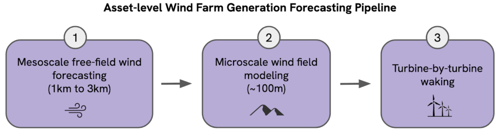
Wind farm forecasting best practices
Asset-level wind energy forecasting requires both highly-accurate weather forecasts of mesoscale wind (on the order of a few km) and sophisticated models of wind field dynamics within the wind farm footprint, which are affected by many factors including terrain, vegetation cover, and turbine waking.
In fact, we find that wind energy modeling best practices dictate separating this problem into three stages: 1) the mesoscale free-field wind2 forecast, 2) the microscale wind field within the wind farm footprint (less than 1km effects usually influenced by terrain), and 3) turbine-by-turbine waking (Figure 1).
Figure 1. Diagram showing three mains steps involved in accurate modeling wind energy at a wind farm.
We are now excited to leverage Sunairio ONE, our high-resolution ensemble weather forecast, to improve mesoscale wind forecasting for asset-level generation.
Existing weather forecasts are too coarse, or fine-but with limited outlook
Surveying the landscape of publicly available weather models that can provide mesoscale free-field wind forecasts shows that none offer truly high spatial and temporal resolution output that extend beyond a few hours (Table 1). Furthermore, Figure 2 helps provide some scale to the current problem, comparing the spatial resolution of Sunairio ONE (at approximately 2km) and the IFS (at approximately 10km) against actual wind farm footprints in ERCOT. Mesoscale forecasting at 10km (like the IFS) vs. 2km may average out important wind gradients that vary over a wind farm and lead to exponential wind generation errors (more on this below).
Additionally, Sunairio ONE forecasts are generated at hourly temporal resolution–critical for energy forecasting applications–for the full forecast period; no other major publicly available forecast model does this. For example, the IFS starts at hourly resolution for the first three to four days but then drops to 3-hourly and 6-hourly steps as it gets further out.
0-90 at 1-hourly 93-144 at 3-hourly 150-360 at 6-hourly
0.1°
~10km
AIFS/AIFS ENS (ECMWF)
15 days
0-360 at 6-hourly
0.25°
~28km
Sunairio ONE
15 years
1-hourly
0.02°
~2km
Table 1. Comparison of forecast models by outlook period, temporal resolution, and spatial resolution.
Figure 2. Zoomed area of map of wind farms in Texas (shaded bounding boxes show footprints of wind turbines at wind farms).
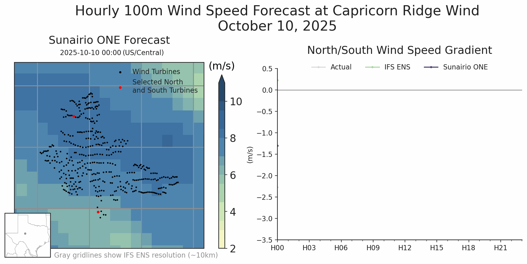
Wind is highly variable across wind farm scales
To visualize just how important it is to capture variations in free-field wind forecasts, we analyzed a day of wind forecast performance (three days out) between Sunairio ONE and the IFS across a major ERCOT wind farm, Capricorn Ridge. As Figure 3 shows, the difference between wind speeds at the north end of the farm compared to the south end (turbines marked in red in left panel) were as great as 3 m/s in some hours. While Sunairio ONE successfully forecasted this wind field gradient (right panel), the lower-resolution IFS could not resolve the proper dynamics, instead seeing a fairly uniform wind field.
Figure 3. (Left panel): Map of Sunairio ONE forecasted wind speed across a wind farm in Texas over a 24-hour period; (Right panel): Line plot tracking the wind speed gradient (i.e., difference in wind speeds) from the north side to the south side of the farm compared toSunairio ONE 3-day ahead forecast and IFS ENS 3-day ahead forecast.
Why it all matters: Even seemingly minor weather variations can have outsized impacts in power output
Does a 3 m/s gradient in free-field wind speed over a wind farm really matter? Depending on the absolute wind speed levels, it can matter immensely. Below their rated capacity, wind turbine power output scales cubically with wind speed which causes even seemingly minor variations in wind speed to lead to large differences in generation potential. Turning to Figure 4, we plot an example power curve of a 1.5 MW turbine, which represents the majority of turbines at Capricorn Ridge. A difference of 3 m/s in wind speed can translate to up to a 959 kW delta in power output, or 64% of rated capacity!
Figure 4. Power curve for the 1.5 MW wind turbines that comprise the Capricorn Ridge Farm. 3 m/s wind speed gradients can translate to power differences as large as 959 kW.
Over a wind farm with hundreds of turbines, the impact of modeling wind speeds at a lower resolution on generation potential forecast performance can quickly add up.
Conclusion
Accurately forecasting local wind speeds is essential for creating reliable forecasts of asset-level generation. Sunairio ONE provides 2km spatial resolution, hourly temporal resolution forecasts that are ideally suited to serve as the critical free-field wind forecast step in wind farm generation modeling pipelines.
Free-field wind speeds are wind speeds expected in open, unobstructed areas free of turbulence caused by structures such as wind turbines. ↩︎
The HRRR goes out to 48 hours only for the 0Z, 6Z, 12Z, and 18Z initializations. All other initializations go out 18 hours. ↩︎
Sunairio ONE In-depth Part 1: Making a Calibrated and Extremes-Conspicuous Ensemble where Benchmark Models Fail
This is the first edition in a series of three blog posts that explores the commercial shortcomings of legacy forecast solutions compared to the advantages of Sunairio ONE.
Introduction: Why the Power Sector Needs Ensemble Forecasts
While every business relies on forecasts to some extent, power sector businesses are forecast super-consumers, especially of weather and weather-based forecasts for power demand, wind generation, and solar generation. In fact the growth of renewables has strengthened the link between weather and energy, introducing weather variability to the supply side of the power grid supply-demand balance. This exponentially increases both the requisite forecast complexity of everyday grid operations and the manifest importance of reliable forecasts themselves.
Regardless of their specific role, power-sector forecast consumers fundamentally make quantitative business decisions that rely on weather forecasts. Yet this business need runs straight into two of the most confounding aspects of weather and weather forecasts: the inherent volatility of weather itself and the large uncertainty of weather forecasts.
Most sophisticated weather forecast users have long recognized that the best-practice solution to this problem is to not rely on one forecast, but many. An ensemble approach to forecasting involves issuing many alternative forecasts for the same phenomenon. A common use case is the ubiquitous hurricane track forecast plot that creates an ensemble of many possible trajectories to convey a sense of probabilistic forecast tracks. There are many ways to generate a forecast ensemble and the concept isn’t limited to weather forecasting, but it is widely accepted to be one of the best methods for investigating forecast uncertainty.
Creating an ensemble weather forecast theoretically satisfies two important needs for decision-makers: 1) it theoretically describes the range of possible outcomes, and 2) it can be used to calculate the implied probabilities of all outcomes within the range.
Properly seeing the full range of outcomes – including extreme events – is absolutely critical in power grid applications because extreme events have an outsized effect on reliability and economic outcomes. For example, in the ERCOT real-time power market, just 1% of hours per year account for one-third of total annual market value1. This means that having a clear view of tail risks is paramount for any power grid planner or power market participant, lest they make decisions with a limited forecast set that hides massive risk.
In this blog post, we evaluate how successful traditional ensemble forecasts and the new Sunairio ONE ensemble are at generating reliable and actionable predictions for power grid/power market applications. We evaluate these ensemble forecasts in three dimensions: calibration (having correct probabilities), sharpness (seeing events clearly), and a new ensemble forecast performance dimension we introduce here: the principle of conspicuous extremes (seeing extreme or tail events).
Classes of Ensemble Weather Forecasts
Ensemble weather forecasts come in many flavors, from the simple historical analogue (a set of historical observations, like historical weather years) to compute-intensive traditional numerical weather prediction (NWP) algorithms, to highly complex deep learning-based generative AI models.
Historical Weather Analogue Ensembles
An historical analogue ensemble of, say, 30 years, constructs a thirty member ensemble where each member of the ensemble is a year of observed weather in the last 30 years. As Historical weather analogues rely on weather observations, serially-complete hourly analogues are generally limited to 75 years or less.
Numerical Weather Prediction Ensembles
Starting from real atmospheric observations, NWPs simulate physical dynamics of the atmosphere to generate a model of future weather. Due to the complex and chaotic nature of atmospheric fluid dynamics, small perturbations in initial weather conditions can lead to dramatically different weather paths. NWP ensembles can take advantage of this by perturbing the initial conditions to simulate an ensemble of “representative” weather realizations. The IFS Ensemble (IFS ENS), an NWP forecast produced by the European Centre for Medium-Range Weather Forecasts (ECMWF), is the gold standard against which all modern weather forecasting systems are compared due to its relatively sharp, skillful short-term forecasts. The IFS ENS consists of one control forecast and 50 additional ensemble paths.
Generative AI Weather Forecast Ensembles
Advances in deep learning have spurred a new paradigm of weather forecasting that borrows ideas from generative AI to produce global weather forecasts that are (1) competitive against the IFS Ensemble and (2) far more computationally efficient. Even without knowing any physical laws, these models, trained on historical reanalysis weather data, produce physically realistic weather patterns. The ECMWF has released an operational ensemble AI weather forecast, the AIFS Ensemble.
Ensemble Performance Metrics: Calibration, Sharpness, and the Ability to See Extremes
The taxonomy of ensemble forecast methods is broad, but many suffer from the same problems: poor calibration, lack of sharpness and poor visibility of extreme events. All of these dimensions are critical for a power sector forecast consumer. A sharp but uncalibrated ensemble will be overly confident but often wrong. A skillful calibrated ensemble that doesn’t satisfy the principle of conspicuous extremes will leave a forecast user exposed to lurking tail risks; you can’t plan for what you can’t see.
Figure 1 illustrates these dynamics. Starting from the left, panel A shows a hypothetical ensemble forecast that is calibrated but not sharp (its implied probabilities are correct but its poor skill means that the ensemble range is very wide), panel B shows an example of an ensemble that is sharp but uncalibrated, while panel C presents an ensemble that is both sharp and calibrated but completely missed an event outright because it does not model extremes. The ensembles in the first two panes have very obvious deficiencies while the ensemble in the third pane exposes the forecast user to more insidious risks – the forecast looks reasonable, performs well in normal weather conditions, but quietly hides tail risks.
Panel D, on the other hand, depicts an ideal ensemble forecast: sharp, calibrated, and extremes-conspicuous.
Figure 1. In the first three panes we show three hypothetical 50 path forecast ensembles that each suffer in one of the three forecast performance dimensions: calibration, sharpness and the principle of conspicuous extremes. In the third, we show an ideal ensemble with 10x as many paths. It is just as sharp as panel C but with more paths, capturing the tails of the distribution.
As we show in this blog post, legacy ensemble forecasts commonly exhibit the deficiencies shown above in A-C, while the new Sunairio ONE method is intelligently designed to replicate the ideal ensemble paradigm in D.
A New Paradigm for Ensemble Forecasting: Sunairio ONE
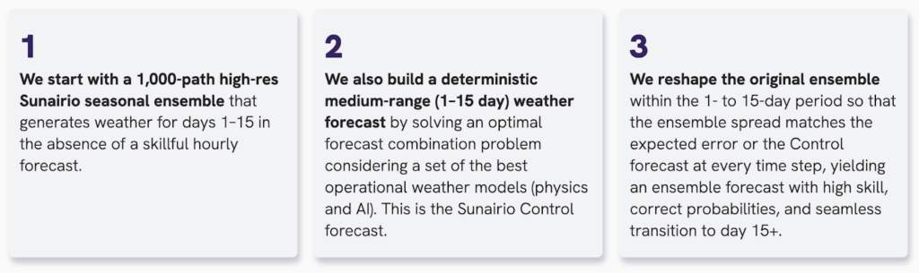
Created in response to the significant limitations of the traditional ensemble forecast classes, Sunairio ONE is powered by a hybrid forecast architecture and designed to maximize commercial actionability. The ONE forecast begins by creating a 1,000-path weather ensemble via a long-range generative weather algorithm that samples from known distributions. Within the medium range window (1-14 days), a deterministic Control forecast is then created by solving an optimal forecast combination problem given the most recent public model guidance. Finally, the original seasonal ensemble is reshaped – conditional on the Control forecast – such that the expected ensemble forecast error matches the ensemble spread.
In the following sections we compare the ensemble forecast of Sunairio ONE to benchmark models in applications for both short and long range forecasting.
Empirical Ensemble Model Performance Analysis
Long-range Forecasts
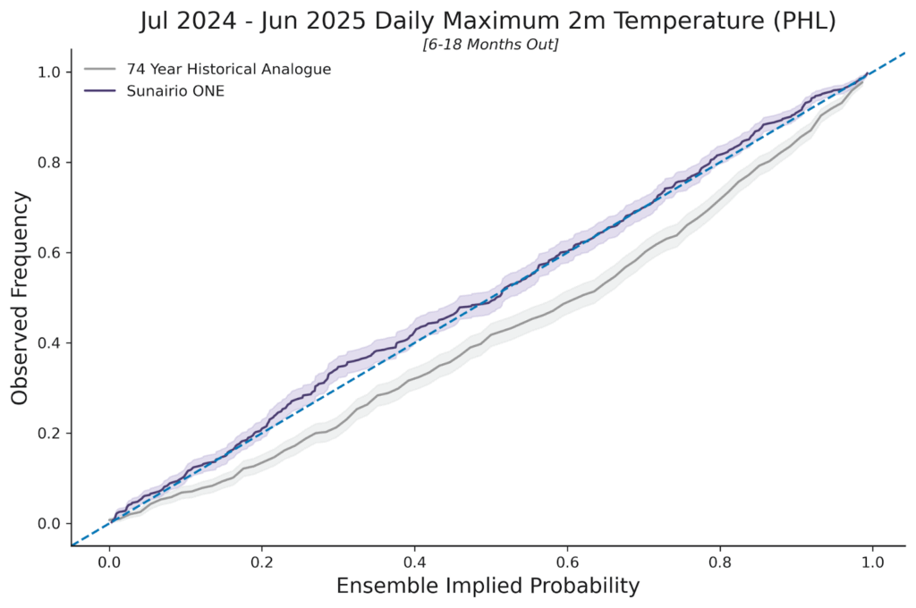
Over longer time horizons (months to years), use of the Historical Analogue approach for ensemble forecasting in the power sector is commonplace as there are no skillful hourly weather forecasts. Accordingly, we compare how well Sunairio ONE performs over a long lead time by examining its performance against a 74-year Historical Analogue. As Figure 2 shows, we plot the ensemble calibration of Sunairio ONE against the Historical Analogue for a 12-month forecast that was issued with 6-18 months forecast lead time, using Daily Maximum Temperatures at Philadelphia airport (PHL). This type of plot, known as a probability-probability (PP) plot, compares the implied ensemble event probability (x-axis) to the actual observed event frequency (y-axis). As the plot shows, a 74-year historical ensemble is poorly calibrated (note how it generally underpredicts the probability of daily maximum temperatures– is biased low–a result of not adjusting for climate change), while the Sunairio ONE ensemble closely hews to the 1:1 line that represents good calibration: implied ensemble forecast probabilities = observed frequencies.
Figure 2. PP plot of 74-year Historical Analogue ensemble and Sunairio ONE for daily maximum temperature for the period July 2024 to June 2025. Historical Analogue for the years 1950-2023. Sunairio ONE trained through 2023 and then predicted for the Jul-24 to Jun-25 period (6 to 18 months forecast lead time)
The Historical Analogue approach also performs poorly when considering its ability to see extremes. As Table 1 shows, the 74-year Historical Analogue completely missed 184 hours per year within the analogue range (a forecast surprise), as there are simply too few samples (74) to accurately represent the range of likely weather over an 8,760 hourly period. By contrast, Sunairio ONE captures 97% of those missed extreme values (178 of the 184 misses) due to the more robust 1,000-member ensemble that’s capable of seeing well past 99th percentile events.
# of Hourly 2m Temperature Surprises, PHL
July 2024 - June 2025
74 Year Historical Analogue (1950-2023)
184
Sunairo ONE (6-18 months out)
6
Table 1. Hourly 2m temperature surprises at PHL for the period July 2024 to June 2025 from two different approaches to long-range ensemble forecasting
Short- and Medium-range Forecasts
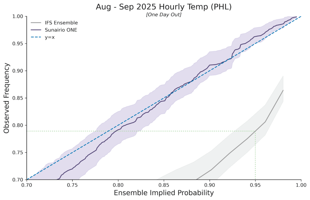
Over shorter time horizons we compare Sunairio ONE to benchmark medium-range (14-day) public ensemble forecast models. As Figure 3 shows, Sunairio ONE again outperforms traditional benchmarks such as the ECMWF’s IFS Ensemble by generating a calibrated forecast – even through the upper quartile event range (events in the 75th to 100th percentile). As we see, Sunairio ONE replicates extreme events at the correct observed frequencies while the IFS Ensemble (the gold standard NWP ensemble) drastically underpredicts them.
For example, the dotted green line indicates that temperatures predicted by the IFS Ensemble to occur no more than 5% of the time (the 0.95 non-exceedance probability level) actually occurred more than 21% of the time (a non-exceedance frequency of about 0.79), meaning that the these temperature events were about 4 times more likely than the IFS ensemble implied.
Figure 3. PP plot of Sunairio ONE and the IFS Ensemble for hourly temperature at PHL. PP plot is zoomed in to the upper quartile. Dotted green line shows that the IFS Ensemble p95 level is actually the observed p79 frequency.
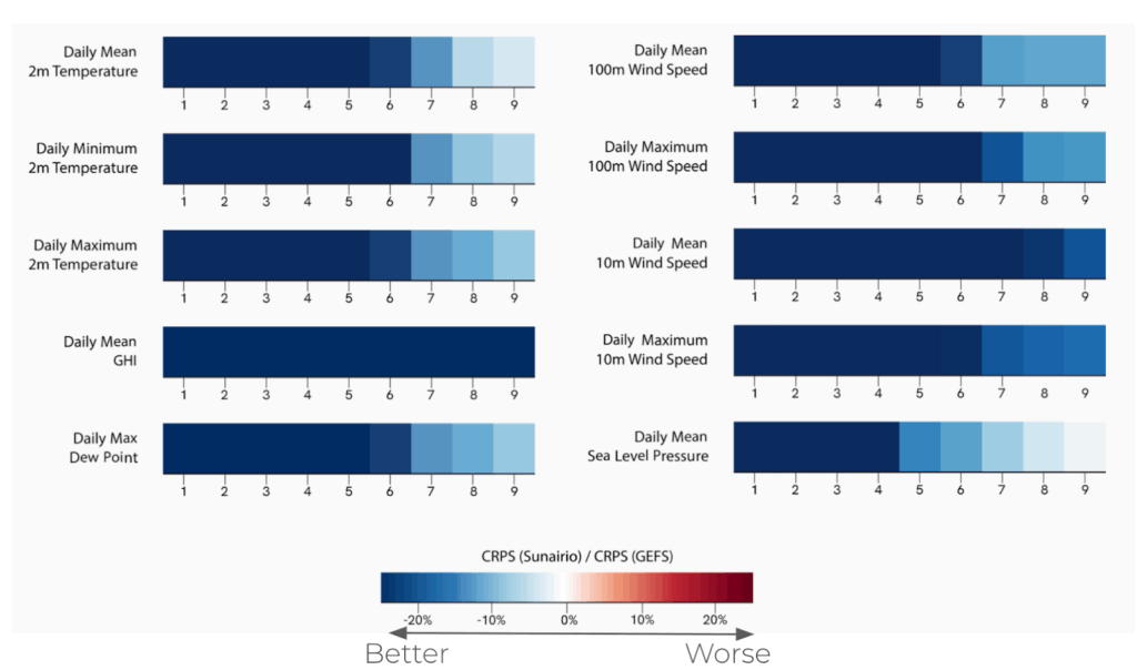
Moreover, Sunairio ONE isn’t just calibrated – it’s also demonstrably sharper than traditional ensemble forecasts. Comparing the continuous ranked probability score (CRPS – a metric used to evaluate the accuracy of a probabilistic forecast) of Sunairio ONE to the GFS Ensemble (known as GEFS, NOAA’s benchmark medium-range forecast ensemble) we see that Sunairio ONE improves CRPS across a suite of weather variables by 20% or more (Figure 4).
Figure 4. Relative improvement in CRPS for Sunairio ONE compared to GEFS across several weather variables and daily aggregations.
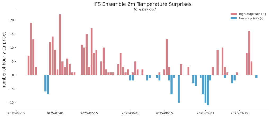
The Sunairio ONE ensemble also does a much better job at seeing extreme events than traditional forecasts. Here we note that traditional weather forecasts actually tend to be worse at seeing extremes the closer they are to happening. For example, Figure 5 plots the number of hourly temperature forecast surprises (events in which the actual temperature realized completely outside of the ensemble range) for the IFS Ensemble at PHL over a period from June 20 to September 22, 2025 – with just one day of lead time. That is, we collected IFS Ensemble temperature forecasts for the following calendar day every day during this period and counted the number of hours in which hourly temperatures realized above or below the 51-member ensemble set.
Over this 95-day period, there were a total of 412 hourly forecast surprises (including misses above and below the ensemble range). Notably, the IFS Ensemble was nearly perfectly unbiased during this period at PHL, with MBE measuring +0.02 deg F, meaning the misses were not caused by the ensemble range being systematically shifted up or down. Rather, the forecast was simply overconfident (and wrong). We do not show the Sunairio ONE forecast surprises in this plot because the Sunairio ONE ensemble did not miss any hours.
Figure 5. Daily counts of hourly forecast surprises (hourly realizations outside the 51-member ensemble range) for the IFS Ensemble, June 20 to September 22, 2025 at PHL, with one day of forecast lead time.
Next we measure the forecast surprises on daily maximums and daily minimums for 1 day, 7 days, and 14 days forecast lead time and compare them to the number of forecast surprises that should be expected given the ensemble size. Table 2 presents the results. As the table shows, the IFS Ensemble missed 3 daily max/min events at 14 days and 8 daily max/min events at 7 days (compared to an expected range of 2 to 6), but missed a whopping 17 days (18.5% of the analyzed period) at just 1 day of forecast lead time. This data suggests that the IFS Ensemble has an inherent underdispersion weakness which becomes more profound as the forecast lead time decreases.
To estimate the magnitude of the underdispersion, we calculate how much wider the ensemble would have to be so that the actual misses fall within the expected range. As the table shows, the underdispersion is at least 1 deg F at 7 days of lead time and more than 3 degrees at 1 day of lead time.
Lead
Sunairio ONE exp. # surprises
Sunairio ONE # surprises
IFS ENS exp. # surprises
IFS ENS # Surprises
IFS ENS Underdispersion
1 day
0 to 1
0 (0%)
2 to 6
17 (18.5%)
> 3F
7 days
0 to 1
0 (0%)
2 to 6
8 (8.6%)
> 1F
14 days
0 to 1
0 (0%)
2 to 6
3 (3.3%)
0F
Table 2. Expected forecast surprises, actual forecast surprises, and estimated underdispersion for Sunairio ONE and the IFS Ensemble. 2m temperature daily maximum and daily minimum forecasts at PHL, one day forecast lead time, June 16 to September 28, 2025.
Real-world Implications of Bad Ensemble Forecasts
Forecast surprises such as these have immense consequences for power grid operators and power market participants because they represent hidden risks that generally haven’t been accounted for in any decision-making. That is, traditional ensemble weather forecasts, especially those issued for the next calendar day, are commonly thought to encapsulate a complete range of risk–but they do not.
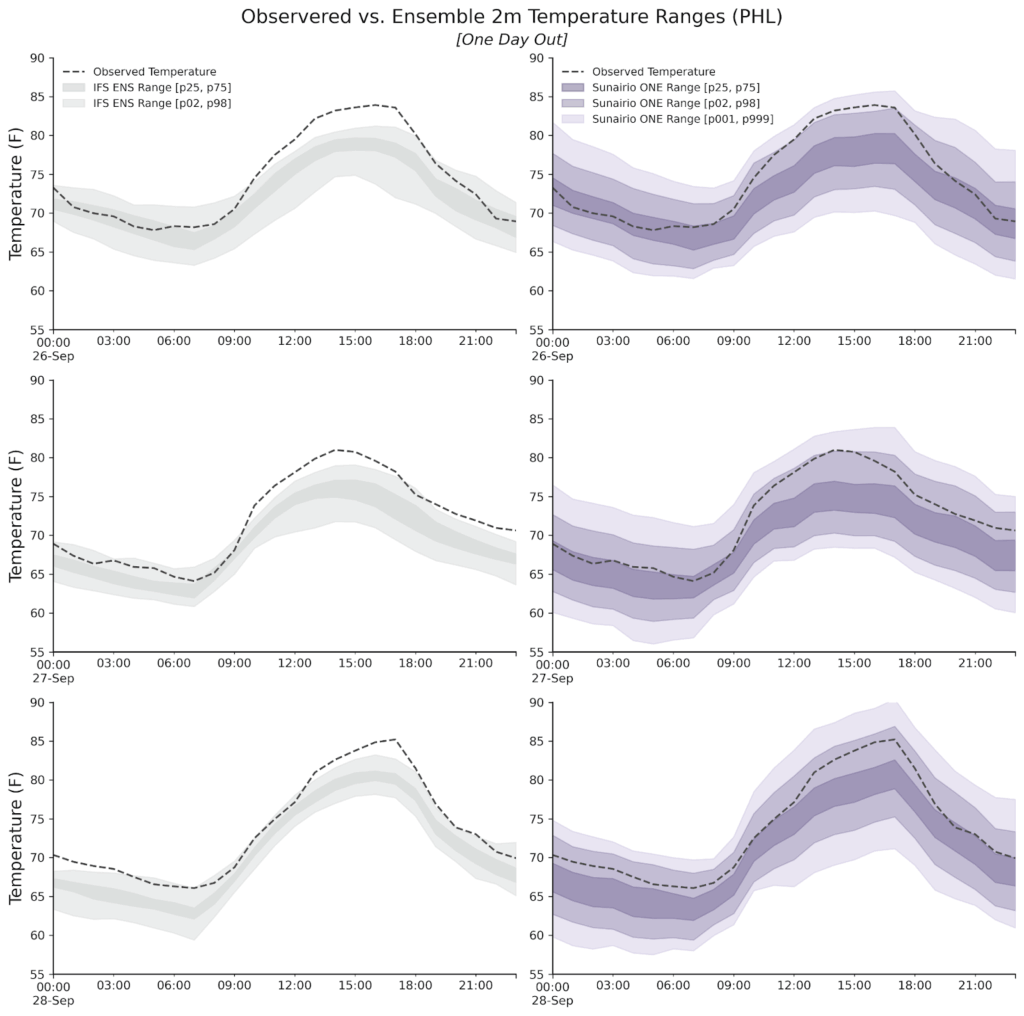
In fact as the left column of Figure 6 shows, during a three-day period from September 26 to 28 this year the IFS Ensemble range missed each day’s maximum temperature just one day out. There are 51 ensemble members within the IFS ENS and not a single one was high enough.
Comparing that performance to Sunairio ONE (right column of Figure 6), we see that while the realized temperature was indeed towards the upper range of our one-day forecast, it was well within the ensemble spread–visible to any forecast user making quantitative scheduling, dispatching, or trading decisions.
Figure 6. One day lead time 2m temperature forecast ensemble range for IFS Ensemble (left) and Sunairio ONE (right), along with observations. PHL airport, September 26-28, 2025.
As these plots show, Sunairio ONE ensembles exhibit the overall characteristics of the ideal ensemble forecast from Figure 1: calibrated, sharp, and showing the risk of extremes.
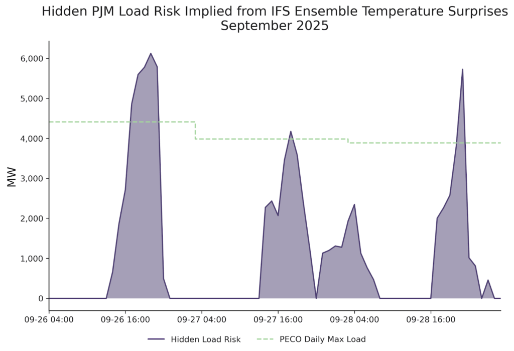
To put the IFS Ensemble forecast surprises in context of power grid balances, we convert the temperature misses seen here into hidden PJM load risks (assuming a similar temperature surprise across the PJM footprint). Figure 7 plots the result, showing that a ~2-4 deg F temperature miss across these hours accounts for up to 6 GW of hidden load risk–equivalent to the regional power demand of the entire Philadelphia metro area!
Figure 7. Magnitude of potential hidden PJM load due to IFS Ensemble temperature surprises, September 26-28, 2025, and daily max load for PECO (Philadelphia Electric Company).
This means that a major city’s worth of demand risk was hiding in plain sight, invisible to forecast users because the benchmark models fail to see extremes – even just one day out.
Conclusion
Ensemble forecasts are critical tools for grid operators, power market participants, and other decision-makers in the energy sector. However, legacy ensemble forecast methods suffer from chronic and significant deficiencies that obscure important risks: missing hundreds of hours per year, misrepresenting event probabilities by a factor of 4, and hiding extreme events equivalent to a city’s-worth of power demand.
Sunairio ONE addresses these problems by intelligently generating an ensemble forecast that’s calibrated, sharp, and sees the all-important extreme events.
Sunairio unveils ONE, a next-gen grid forecast model with unprecedented fidelity at all time scales
Sunairio ONE captures 97% of extreme events that traditional forecasts miss, providing critical intelligence for grid reliability, power systems planning, and energy markets
Baltimore, MD. — October 16, 2025 —Sunairio, pioneer of next-generation grid forecasting software that provides critical weather and energy insights, announced today that it has launched Sunairio ONE (an Omniscale Next-generation Ensemble). Sunairio ONE now powers the company’s award-winning software for modern energy risk management.
Anticipating granular grid risk today is a daunting task that’s frustrated by a disjointed and inadequate technology landscape. Conventional weather forecasts are complex and slow, limiting their usefulness to modeling near-term events over relatively large areas — with forecast scenarios that misrepresent the chance of extremes. Longer-term forecasts are so inaccurate that the meteorological agencies themselves warn against using the data directly, forcing the industry to rely on historical analogues instead. And the new AI weather forecasts are unfortunately linked to these problems because they train off the same old data.
Sunairio ONE makes these approaches obsolete.
“We built Sunairio ONE from the ground up to solve these challenges, enabling unparalleled resolution, accuracy, and correct probabilities, complete with seamless coverage for the next hour, the next 15 years — and anywhere in between,” said Rob Cirincione, CEO, Sunairio.. “The key is our unique data — Sunairio ONE is trained on the Sunairio High-resolution Earth Dataset (the SHED), our proprietary, high-resolution historical weather data archive that’s purpose-built to replicate granular risks for the modern grid.”
Sunairio started with the industry’s benchmark historical weather data, leveraged machine learning to sharpen resolution by 100x, then trained ONE on that data while incorporating changing climate fundamentals. Sunairio ONE generates 1,000-member hourly ensembles compared to traditional methods that stop at 50. The result is unprecedented forecast fidelity for load, renewables, and grid stress across all time scales.
“Alternative forecast methods rarely issue more than 50 forecast scenarios, preventing users from seeing the make-or-break events,” Cirincione explained. “Imagine if I told you there was a 1-in-50 chance of winning the lottery, except you don’t win the lottery, you black out the power grid or bankrupt your company. That’s the risk we’re taking with these limited forecasts.”
“More recently, there’s been a burst of new AI-powered weather forecasts, but what often gets overlooked is that these AI models are only as good as the data they’re trained on — and these models have all been trained on the same public, relatively low-resolution archive,” continued Cirincione. “That means they’re all susceptible to missing the same events — especially extreme events — which are critical in modern power grids where just 1% of hours account for 30% of grid stress.”
A larger forecast ensemble also improves accuracy. For example, compared to grid-level forecasts provided by ISO operator ERCOT, Sunairio’s hourly wind and solar forecasts are up to 20% more accurate on average while capturing the true risk of forecast misses and unprecedented extremes in the ensemble distribution.
Sunairio ONE is an evolution of the company’s award-winning, long-term generative forecast technology — previously recognized by the National Science Foundation, American Clean Power Association, and EPRI. The company’s high-resolution, large-ensemble approach to forecasting now spans both seasonal and climate scales (from 15 days to 15 years) as well as shorter-term 1- to 15-day forecasts.
"No other solution gives us weather and energy forecasts from a 1,000-member ensemble and continuously tracks changes to load growth and infrastructure buildout," said Josh Henson, Vice President, Wholesale Trading, Constellation. “We’ve been pleased with Sunairio as a platform to model probabilistic weather and energy risks for longer-term power markets. Sunairio ONE provides those same insights for short-term markets enabling better business decision-making that benefits our customers.”
Sunairio ONE forecasts support actionable intelligence for reliable planning across power markets and utility operations. It is designed to support a range of use cases, including:
Probabilistic energy trading and hedging strategy: Ensembles predict future energy price ranges and show potential for risk versus reward.
Asset-level renewables forecasting: Sunairio ONE provides probabilistic forecasting for individual renewable energy assets (including availability and curtailment losses) for independent power providers, utilities, and public market participants.
Climate-aware portfolio risk management: Accurately calculates the risk to energy investments resulting from weather-driven impacts across load, wind, and solar.
“Some of the greatest risks to power grids are hiding in plain sight. They don’t always look like hurricanes, which makes them more insidious. Increasingly, they look more like unusual combinations of weather that increase demand while reducing renewables output: heat that lingers past twilight or polar vortex cold snaps that arrive with calm winds,” said Raiden Hasegewa, PhD, Director of Data Science, Sunairio. “By combining weather and energy in a sophisticated forecast model, we’re giving companies insight they can’t get anywhere else.”
All of Sunairio’s energy and market models built on top of Sunairio ONE automatically update and retrain continuously, keeping pace with fast-moving fundamentals. For more information, please visit sunairio.com or email info@sunairio.com.
###
About Sunairio Founded in 2020, Sunairio is the pioneer of award-winning, next-generation grid forecasting software that’s the first to provide integrated energy, weather, and climate insights. Sunairio helps energy traders, grid operators, utility-scale asset developers, and VPP and demand response aggregators make better commercial decisions in the face of increasing grid variability and extreme event risks. Sunairio and Sunairio ONE have received recognition from the NSF, ACP, and EPRI. For more information, please visit sunairio.com.
Media Contact Nikki Arnone, Inflection Point Agency for Sunairio nikki@inflectionpointagency.com
Increased solar generation is shifting price risk later into evening in PJM
Late last month, on June 24, 2025, PJM experienced a record-setting heatwave that sent heat indexes soaring above 100oF throughout the Mid-Atlantic, hotter than anything observed in late June since at least 1950. This extreme weather event sent regional power demand and prices spiking — though not at the same time.
The price spike occurred in the two hours after demand peaked that day — a (perhaps unexpected) consequence of the growing reliance on renewables in PJM. Here's how solar fundamentally changed PJM's risk profile on that sweltering June day.
How net load drives grid stress and power prices
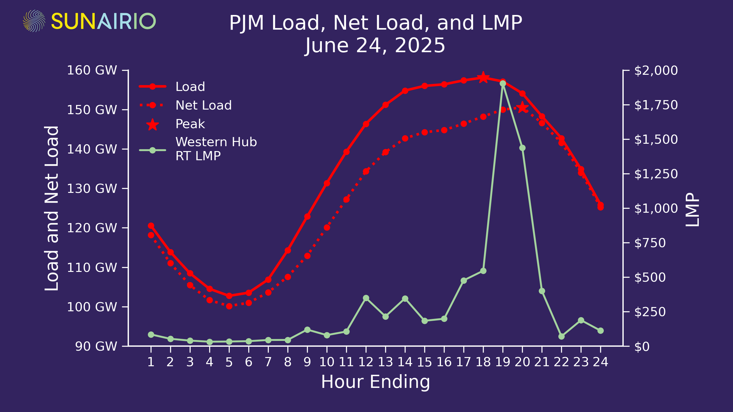
Net load — not native load — drives today’s price spikes. PJM native load peaked in hour ending (HE) 18, but Western Hub LMP spiked to $1,500/MWh+ in subsequent HE 19 and 20, as the plot in Figure 1 shows.
Why? Because those are the hours in which net load peaked. As we’ve discussed before, net load (native load minus renewables) is the primary driver of grid stress in power markets with a significant share of renewables. And when grid stress rises, so do prices.
We can now officially count PJM as a market in which renewables can’t be ignored.
Figure 1. PJM load, net load, and Western Hub LMP for June 24, 2025.
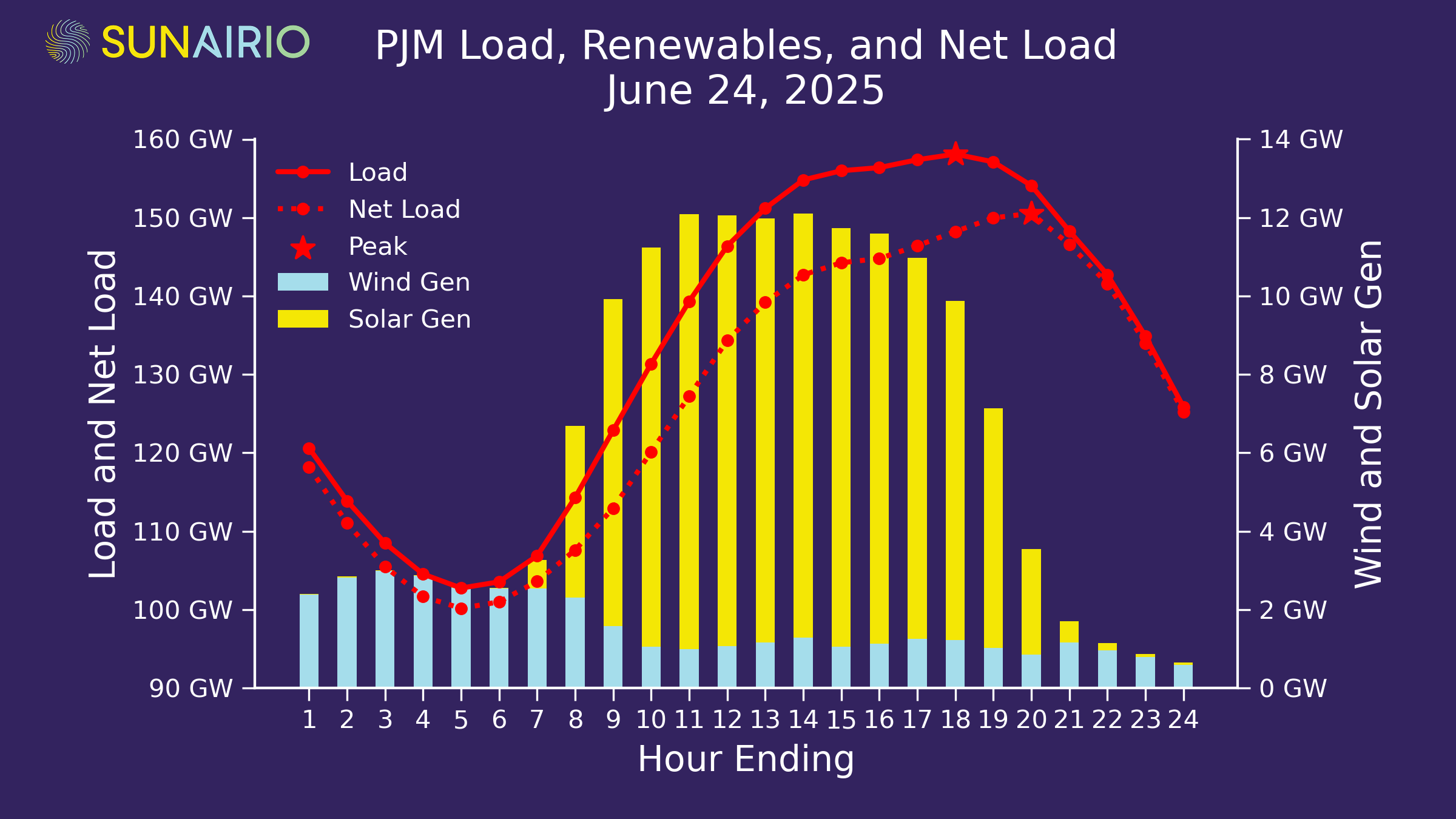
As Figure 2 shows, there was approximately 10 GW of solar generation in PJM on June 24 during hours 10–17, which significantly reduced net load — and therefore grid stress — throughout the day. Even in the peak load hour (HE 18) there was still 9 GW of solar generation.
But this solar output dropped precipitously as the sun set across the ISO footprint to just 3 GW in HE 20 — causing net load (and overall grid stress) to continue to rise even as native load was falling. The resulting net load ramp required PJM to quickly dispatch expensive units to stabilize the grid.
Figure 2. PJM load, wind generation, solar generation, and net load for June 24, 2025.
The end result? The highest prices we’ve seen in PJM since 2022 occurred much later in the day than would have been historically expected for this period in June.
Solar is shifting PJM fundamentals
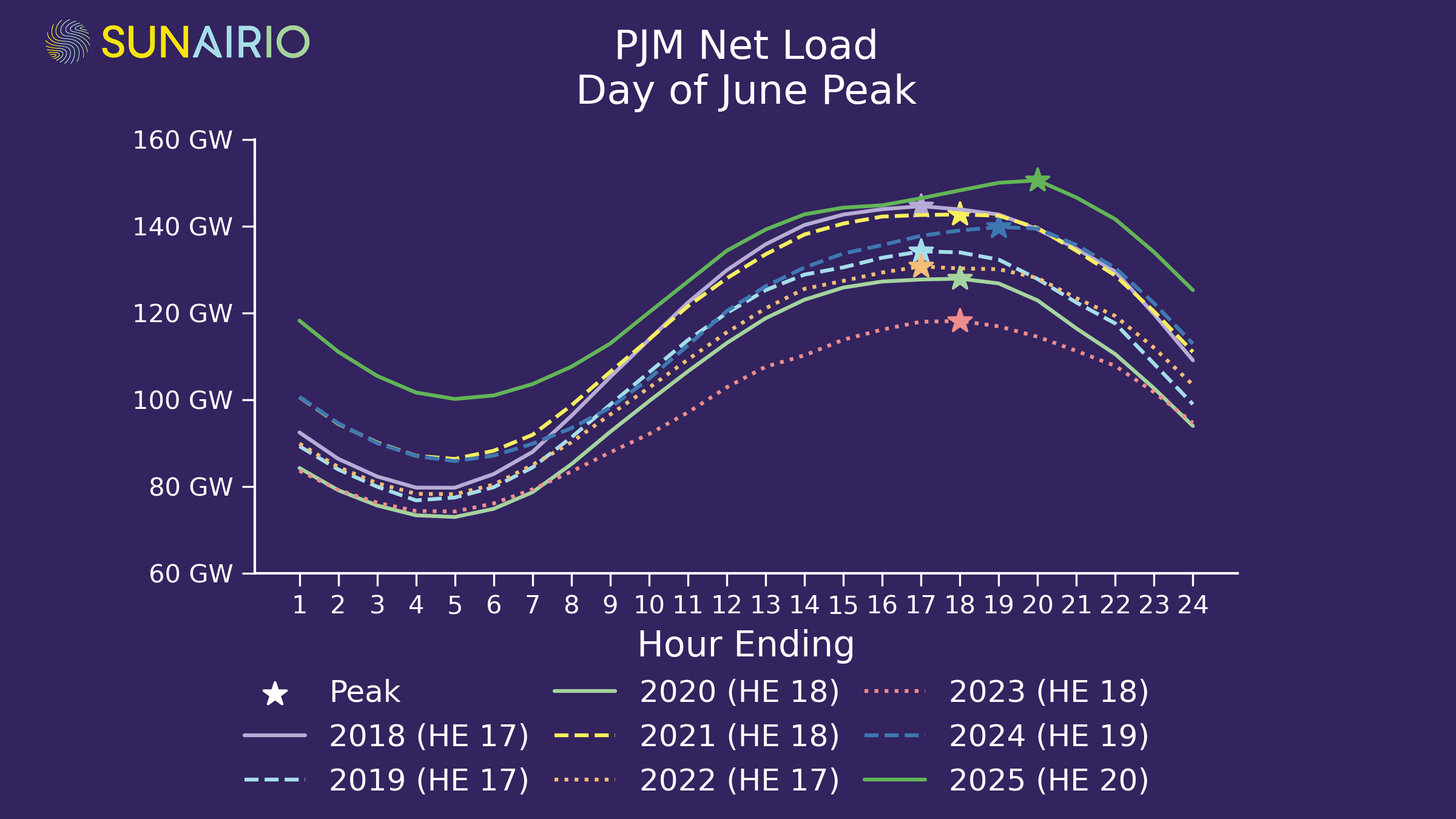
Peak net loads have been creeping later in the day for some time. The highest net load hour in June has shifted from HE 17 in 2018 and 2019 to HE 20 this year, as Figure 3 shows for each June’s highest net load day since 2018.
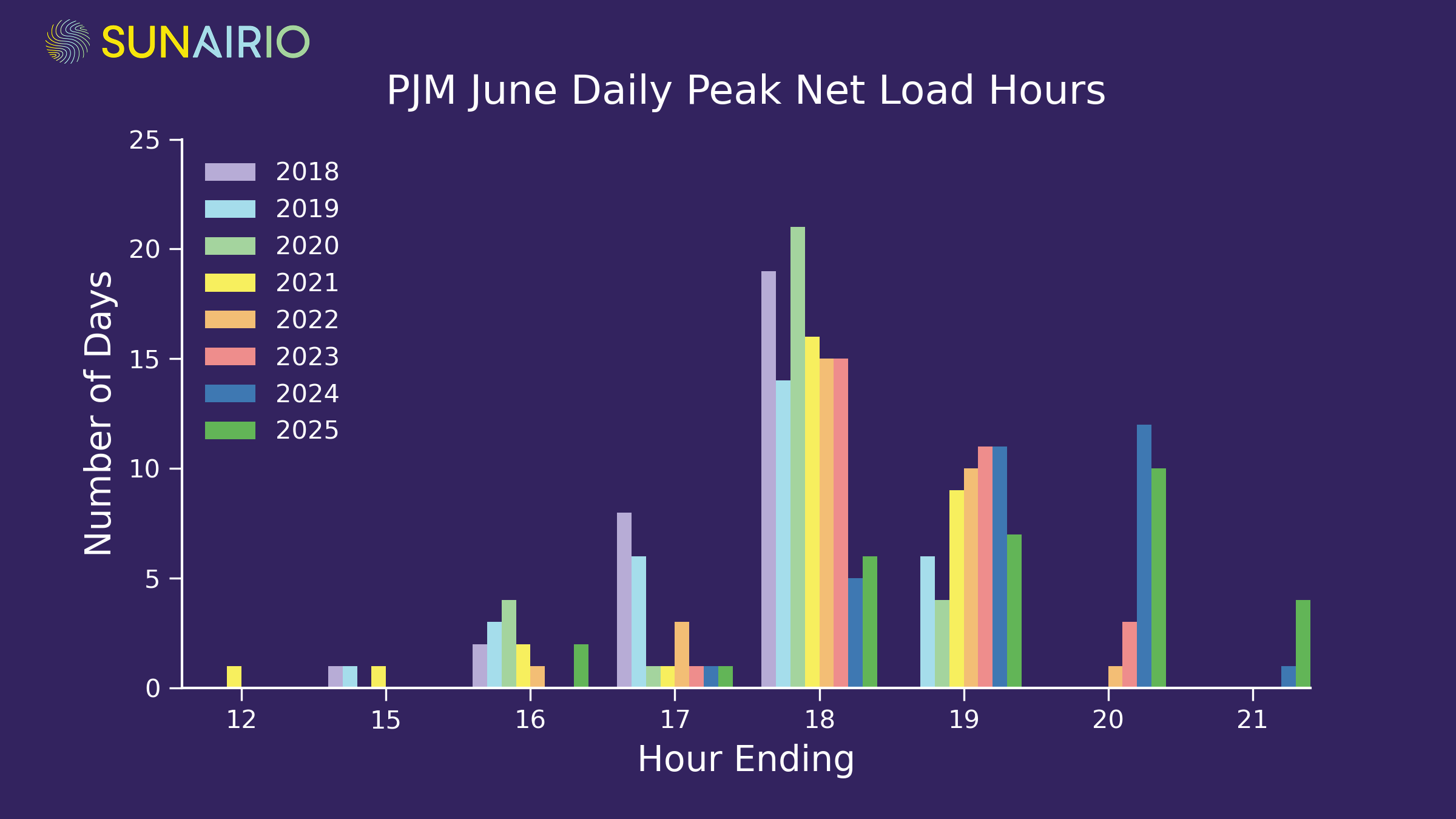
This pattern extends to less extreme days as well: 70% of daily net load peaks occurred at hour ending 19 or later in 2025 compared to 0% of peaks occurring that late in June 2018, as Figure 4 demonstrates across all June days since 2018.
Figure 3. Hourly net load for the highest net load day for each June from 2018–2025.Figure 4. Distribution of the hours that the highest net load hour occurred in over all days in the month of June, 2018–2025.
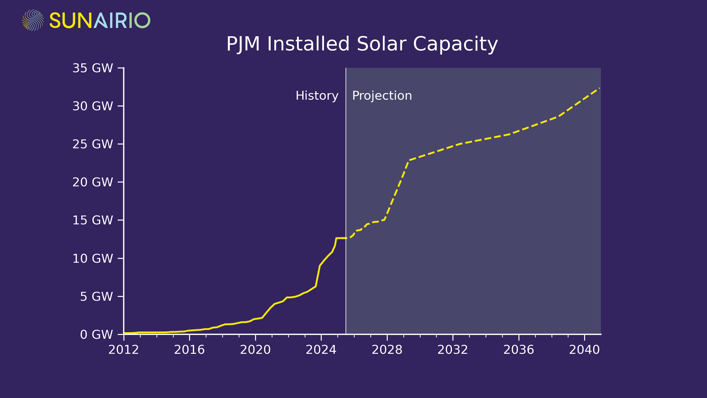
This intraday net load pattern shift mirrors the massive growth of installed solar capacity in PJM. Utility-scale solar capacity has increased roughly 500% since 2020, from 2 GW to more than 12 GW as of June 2025, as Figure 5 illustrates.
Figure 5. Historical and projected installed utility-scale solar capacity in PJM.
As solar penetration increases in PJM, it drives greater price volatility and concentrates the highest price risks later into the evening hours during summer months.
Fundamentally, it creates a grid management challenge as the quickly setting sun necessitates a steep ramp for other generators to be brought online. This highlights the need for accurate net demand (load, solar, and wind generation) forecasting and fast-ramping resources to successfully enable renewables integration.
Even with the headwinds that new solar projects face today, we still expect a sizable capacity addition over the next few years as projects that are under construction reach completion and the pipeline of projects that qualify for remaining tax incentives break ground.
The bottom line: add PJM to the list of power markets whose fundamental outcomes are increasingly controlled by the intraday volatility and intermittency of weather-driven generation resources.
Grid planners make decisions based on historical data. What happens when history doesn’t have the answers?
In modern electric grids, grid operators must continually balance power demand with power generation to maintain steady grid frequency and ensure overall grid stability. This entails anticipating, in real time, short-term weather-driven changes in both customer load and renewables output to match the remaining “net demand” with dispatchable generation. Grid planners, on the other hand, look far into the future to ensure long-term “resource adequacy” — i.e., that future generation resources will be sufficient to cover demand under all possible weather scenarios and grid conditions.
Satisfying resource adequacy through long-term grid planning processes is a critical component of grid reliability because generation resources and transmission infrastructure can’t be built in the few days ahead of a forecasted heat wave or winter storm.
To study long-term resource adequacy, grid planners:
Construct a set of future weather scenarios
Make some assumptions about asset-level availability
Calculate the resulting hourly net demand given anticipated customer load projections and renewable energy capacity buildout
Quantify the likelihood of capacity shortfalls that would necessitate shedding load to maintain grid stability (i.e., brownouts or blackouts)
Resource adequacy studies, in other words, rely on an accurate characterization of future weather variability. In practice, grid planners typically use historical weather as a proxy for future weather — tacitly assuming that a) future weather will be similar to historical weather and b) historical weather is a large enough sample to assess the risk of extreme events.
Unfortunately, both of these assumptions are wrong. Future weather is different from historical weather. Average temperatures, wind speeds, and irradiance are all expected to shift over time from climate change effects, to varying degrees and in different directions depending on what region is being studied. Moreover, the shape of weather distributions will also change. For example, climate modeling shows that extreme cold risks may actually become more frequent in the future as climate change weakens the jet stream — even though average temperatures will rise. That means that the bottom tail of a temperature distribution gets longer while the rest of the distribution shifts right.
Regarding the second assumption — that we have enough historical weather data to assess extremes — the historical record is much smaller than you might think.
First, we can only use serially-complete historical datasets that have values for every hour of the year because we can’t make reliable statistics from partial-year data. This generally excludes airport station temperature data before 1980.
Next, we have to find high-quality weather data to model wind and solar generation. Traditionally, that has meant relying on satellite-based irradiance data (available since 1998) and the NREL WIND Toolkit, which is a high-resolution wind speed dataset calculated for 2007-2013.
As a result, a resource adequacy study that includes correlated temperature-driven load, irradiance-driven solar generation, and wind-driven wind generation would only be able to call upon 7 historical year samples — drastically limiting the view of weather extremes that the grid could face.
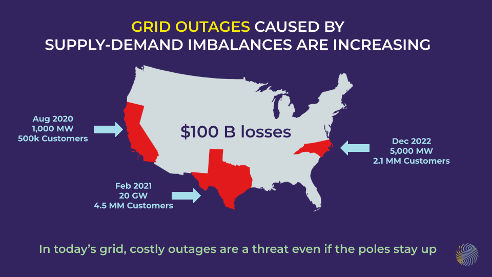
Sadly, flawed grid planning due to insufficient weather assumptions can lead to catastrophe, with major power outages occurring recently in California (2020), Texas (2021), and North Carolina (2022). An NREL post-mortem of all three events found modern electric grids, which increasingly rely on intermittent weather-dependent renewable energy generation, to be increasingly impacted by extreme weather conditions — and that “weather in recent years has exceeded the bounds of anticipated conditions,” highlighting the need for improved planning processes that accurately account for jointly correlated extremes of weather, power generation, and generation outages.
To fill this gap, Sunairio generates a 1,000-path ensemble of future hourly weather to give grid planners robust, complete, and actionable distributions of weather, grid conditions, and asset-level variability. This ensemble is climate-change adjusted, trained on the longest possible series of weather data, and numerous enough to gain intelligence into future extreme events — in whatever form they may come.
Spring weather is volatile. So are power markets. 2025 is no exception.
For plants, spring is a season of growth. But for power market participants and grid operators, it’s a time of surprises and volatility.
While typically mild spring weather results in low expected grid demand, extreme spring weather — through a confluence of factors — can drive real-world hourly grid balances to levels that approach or exceed emergency conditions. This contrast between mostly moderate days and acute periods of serious grid stress makes spring just as challenging to navigate as the traditional “peak” seasons in summer and winter.
Properly anticipating this inherently stochastic risk requires both a nuanced understanding of the underlying fundamentals and a probabilistic framework to quantify low-probability but high-impact economic and reliability outcomes. In this blog post, we examine actual weather, grid, and market events from this spring in ERCOT within a probabilistic context. Looking ahead to spring 2026, we then explore how rapidly changing grid fundamentals may alter next year’s spring grid risk profile.
Late season cold and an early heat scare in Texas
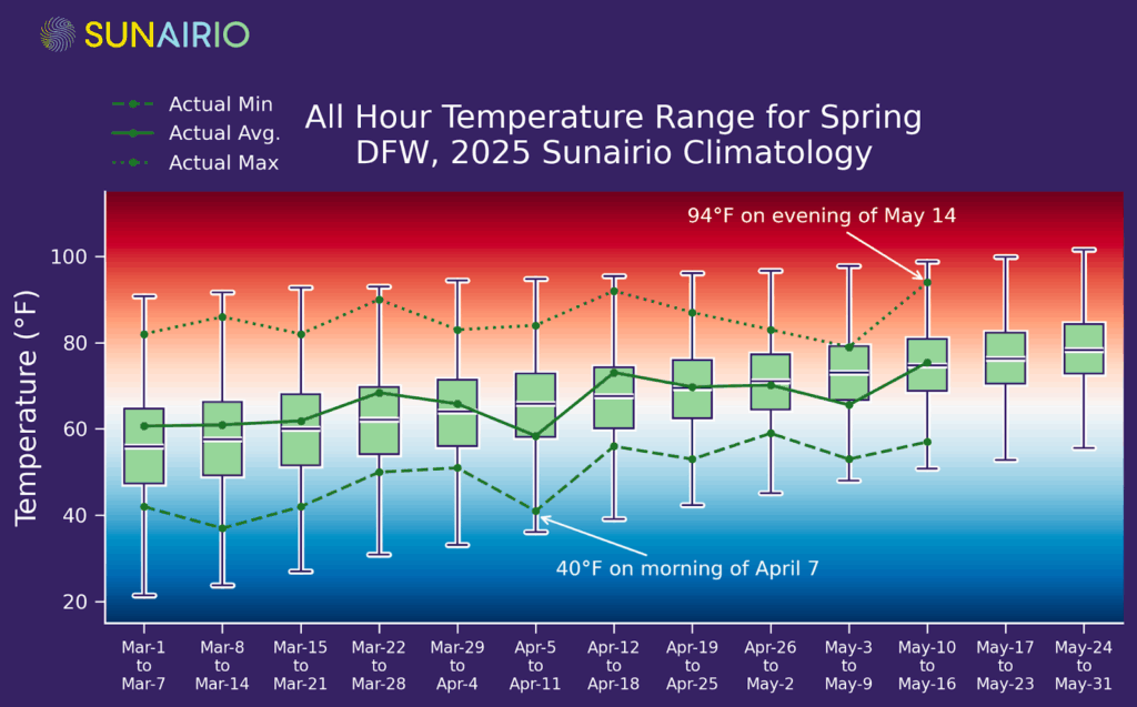
This year has not been an exception to the rule that spring weather varies wildly. Temperatures on April 7 dropped to 40ºF at DFW and into the 30s around Dallas (colder than all of March) while an early season heat wave drove forecast highs over 100ºF last week (levels not typically seen until July).
Figure 1 plots this spring’s weekly average, minimum, and maximum temperatures (green lines) against ranges derived from Sunairio probabilistic climatology (box and whisker plots) at DFW. As the plot shows, most hourly temperatures throughout spring are relatively mild — between 50ºF and 70ºF — but extremes dip into freezing territory and extend into severe heat.
Figure 1. Sunairio probabilistic climatology temperature ranges (box and whisker plots) vs actual average, min, and max weekly temperatures (lines). Background gradient represents cold (blue), comfortable (white), and hot (red) temperatures.
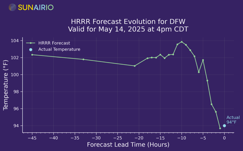
An epic forecast fail
Temperatures could have been even more extreme this year if the weather forecasts for the May 12 week hadn’t flopped. As we see in Figure 2, the forecast for the May 14 afternoon high at DFW was 102ºF just 12 hours out — yet realized 8 degrees lower at 94ºF. That 8-degree temperature forecast error likely reduced ERCOT RTO load by approximately 9 GW versus higher temp load expectations, leading to a $40 Day-ahead/Real-time spread (DA higher than RT) — highlighting the difficulties of navigating grids amid temperature variability and forecast uncertainty.
Figure 2. The forecast evolution for the afternoon high temperature at DFW on May 14 from NOAA’s High Resolution Rapid Refresh (HRRR) model — a high-resolution, short-term forecast.
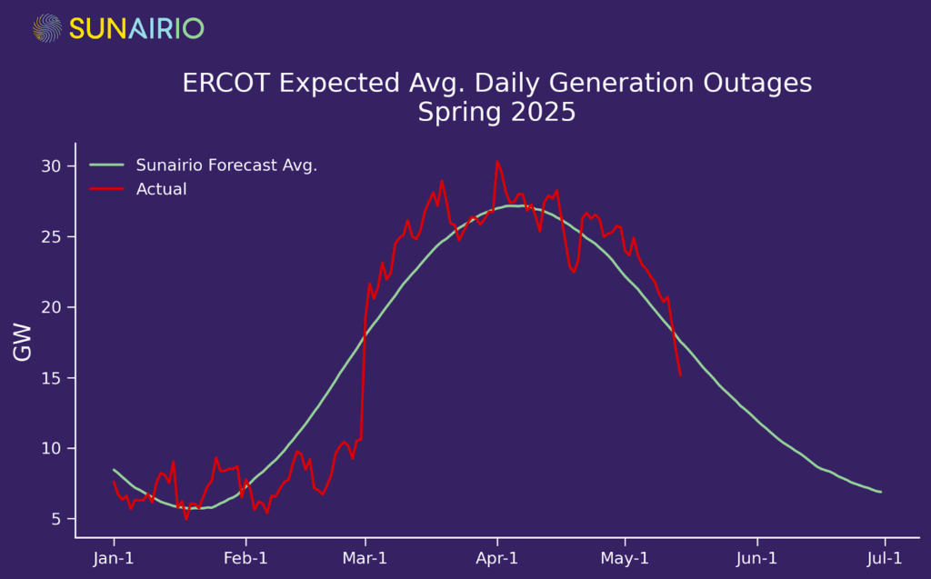
Generation outages peak
In spring, dispatchable resources are often not available on purpose. Given that the majority of Texas spring weather is mild and that the season immediately precedes the peak demand summer months, generators schedule the bulk of their maintenance outages during this time. As we see in Figure 3, nonrenewable (thermal) generation outages usually peak in early April (coinciding with the mildest expected temperatures and lowest expected load), though unscheduled outages can cause significant variability. Ironically, such high levels of dispatchable unit outages can tip the grid from normal conditions into capacity shortfalls. Scheduling generation outages in spring makes sense, until it doesn’t.
Figure 3. Sunairio average forecast of daily nonrenewable generation outages in ERCOT (green) and actuals (red).
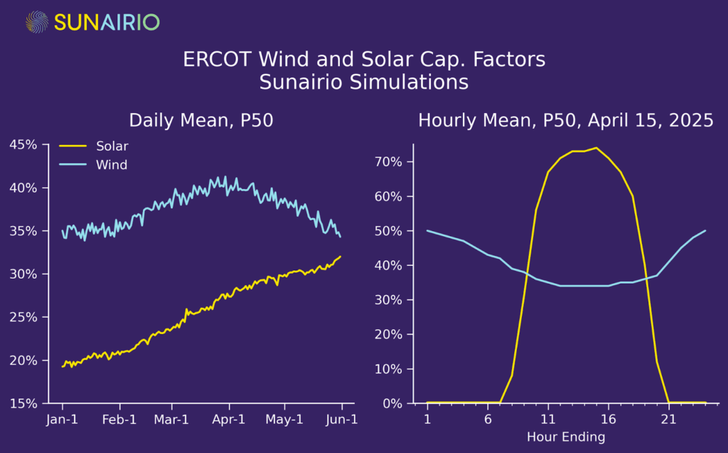
Renewables ramp up
Temperatures and unit outages aren’t the only thing rising in ERCOT during spring. Wind generation typically maxes out in early April and solar generation typically increases by 38% from March 1 to May 31. Further complicating grid dynamics are intraday generation patterns, where wind generation peaks overnight and solar generation is dictated by the diurnal sunup-to-sundown cadence. Figure 4 plots both these seasonal (left panel) and intraday (right panel) trends.
Figure 4. Sunairio daily mean (left) and hourly mean (right) P50 wind and solar generation capacity simulations for ERCOT.
Implications for power markets and reliability
Understanding grid risk these days is much more than understanding a simple temperature -> load relationship. It’s a multidimensional puzzle whose solution is driven by correlated variability between load, wind generation, solar generation, and the availability of dispatchable resources. It’s sensitive to temperature extremes, shifts in renewable generation patterns, and unit outages.
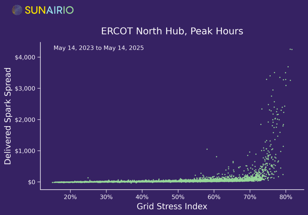
At Sunairio, we combine these fundamentals into one metric that provides a reliable indicator of overall grid stress — the Grid Stress Index (GSI), which measures the ratio of Net Demand (load minus renewables) to Available Dispatchable Capacity (read more about the construction of GSI here).
As Figure 5 shows, this metric anticipates hourly price volatility, with conditions in ERCOT (measured by delivered spark spreads) being relatively tame until GSI surpasses 60% — and becoming extremely volatile as GSI rises above 70%.
Figure 5. The ERCOT Grid Stress Index (GSI) vs. hourly delivered spark spreads at North Hub. Spark spreads are calculated with a 6.5 heat rate and a local Texas delivered gas index.
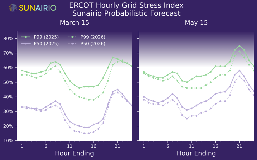
To understand grid risks on spring days, we use Sunairio’s historical simulations in Figure 6 to plot expected (P50) and extreme (P99) hourly GSI in both early (March 15) and late (May 15) spring 2025. For clarity, we shade the background darker above GSI = 60% to reflect increasing price risk. As the plot shows, while the majority of hourly conditions in spring fall below the 60% level corresponding to high prices/capacity shortages, extremes in several hours present significant risks.
In particular, cold mornings and low renewables can drive hours ending (HE) 7–9 to the danger zone in early spring (left panel, Figure 6), while afternoon heat and decreasing solar in the evening drives HE 20–22 even further beyond in late spring (right panel, Figure 6).
Figure 6. P50 and P99 hourly ERCOT Grid Stress Index for March 15, 2025 (left) and May 15, 2025 (right) from historical Sunairio probabilistic forecasts. Background shaded above GSI=60% to reflect increasing price risks.
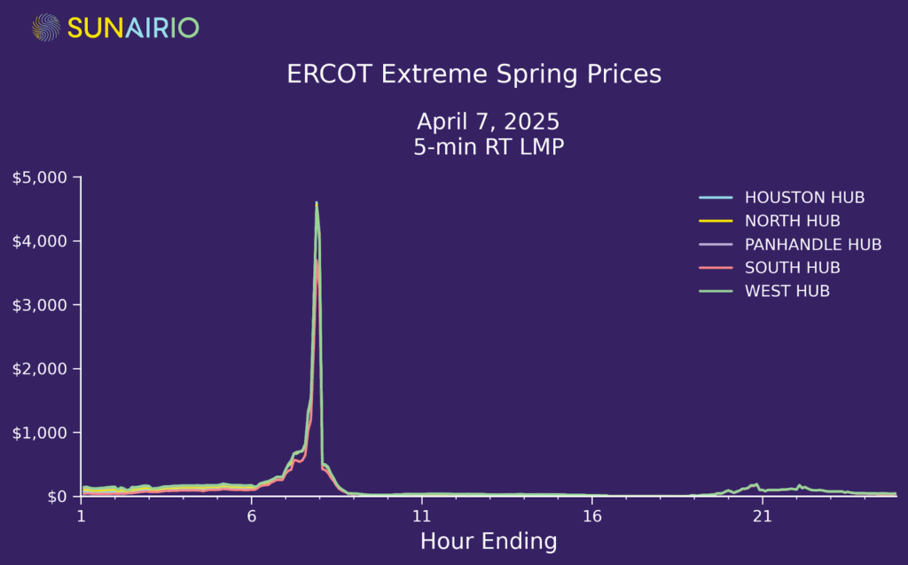
Indeed, on the exceptionally cold early spring ERCOT morning this year (April 7), we saw prices spiking close to the price cap in ERCOT and averaging $1,552/MWh in an hour (Figure 7) due to high GSI resulting from exactly this combination of low temperatures (dipping into the 30ºFs surrounding Dallas, low renewables (minimal solar at HE7), and high generation outages (25+ GW).
That one hour on April 7 added approximately $4/MWh to the monthly peak price, meaning that just 0.2% of hours in the April peak contract (1/352) accounted for 10% of the entire contract value.
Figure 7. Five-minute LMP for ERCOT market hubs on April 7, 2025.
Looking ahead to 2026
With the spring drama almost behind us for 2025, what should we expect next year? Accounting for load growth and new unit additions/retirements, we find that conditions should generally be calmer next year across all spring hours. In other words, generation additions will outpace load growth — though the risk of acute price spikes remains, especially in the evening. As Figure 8 shows, P50 and P99 hourly GSI in both early spring (March 15) and late spring (May 15) are expected to be lower in 2026 compared to 2025, representing downside risk to ERCOT market prices.
Figure 8. P50 and P99 hourly ERCOT Grid Stress Index (GSI) for March 15 (left) and May 15(right) in 2025 and 2026 according to Sunairio probabilistic forecasts.
Navigating spring volatility
Spring volatility highlights the challenges of managing grid and energy markets risk without a robust framework for evaluating the jointly correlated, multidimensional, granular, and skewed nature of the electric grids. To effectively navigate this period, grid planners and energy traders need to understand the complicated interplay between averages and extremes — to expect not just the seasonal trends but also to expect extreme events that drastically alter reliability and economic outcomes. It’s not enough to know that ERCOT grid balances for HE 7 typically don’t present much of a risk. We need to quantify the risk — via, for example, stochastic simulations — that weather and grid conditions conspire to drive capacity reserves low and market prices to the moon (as they did during HE 7 on April 7, 2025).